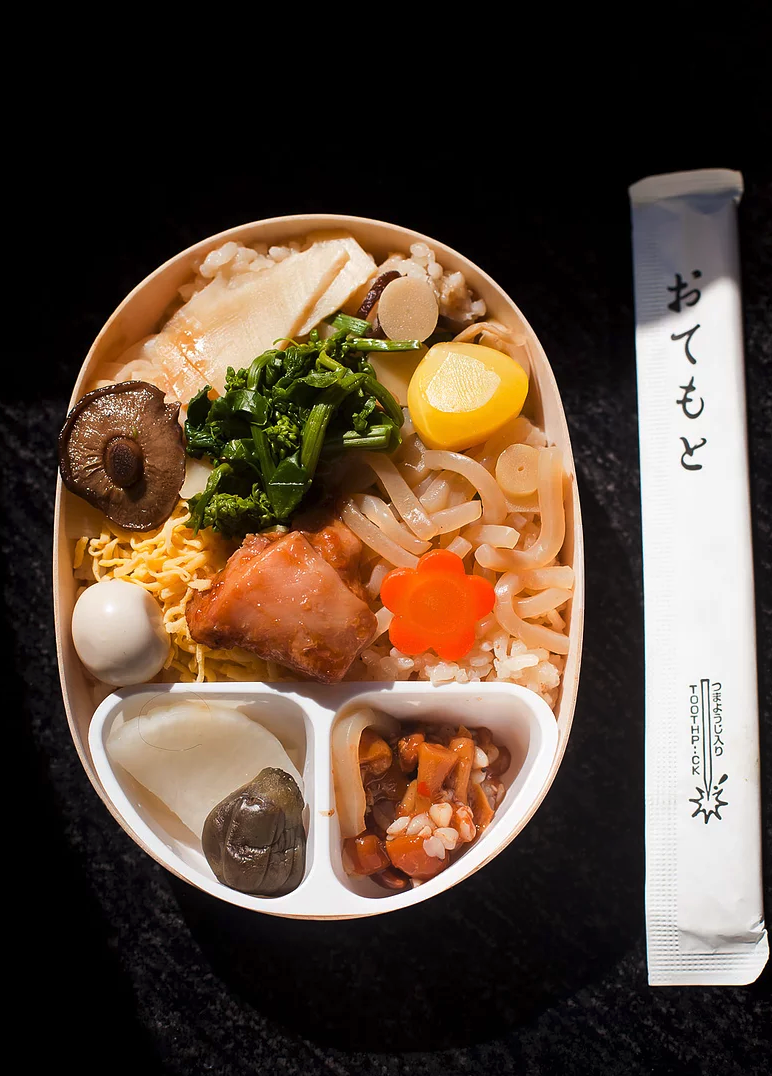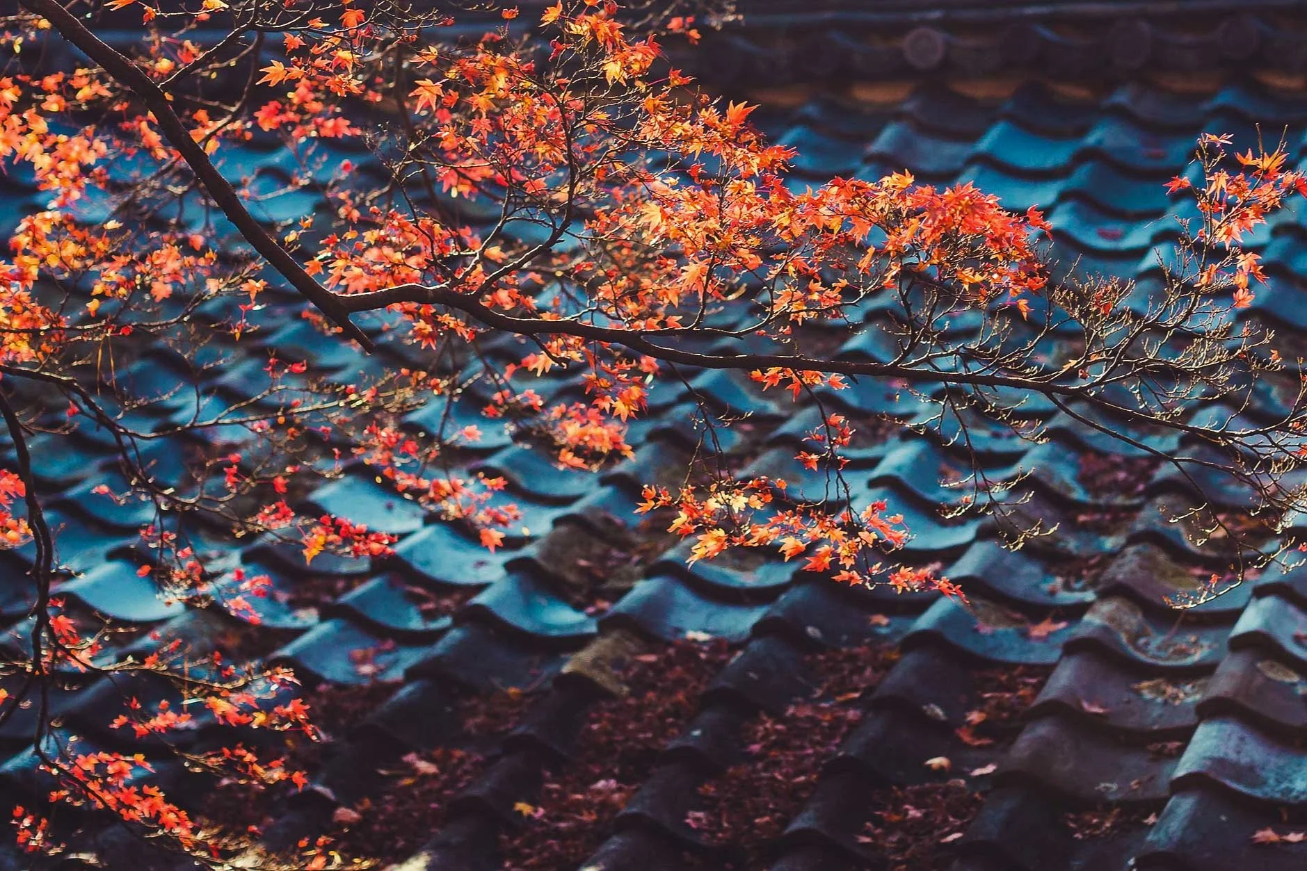

Tourism in Japan is growing, and fast. According to JNTO, the estimated number of international travelers to Japan in March 2018 was about 2.6 million (+18.2% from the previous year), making it the biggest March ever.
Tourism in Japan is growing, and fast. According to JNTO, the estimated number of international travelers to Japan in March 2018 was about 2.6 million (+18.2% from the previous year), making it the biggest March ever.
Once again in a series of articles for my frequently visited cities, I have compiled a list of locations for first time photographers to Madrid. The list is open to interpretation and I encourage you to go off the beaten path.
Bombo is a two-hour drive south of Sydney. The best way to access Bombo Quarry is from Darian Avenue. From your car it's a 15-minute walk to various part of the quarry with numerous vantage points depending on the time of day and the tide.
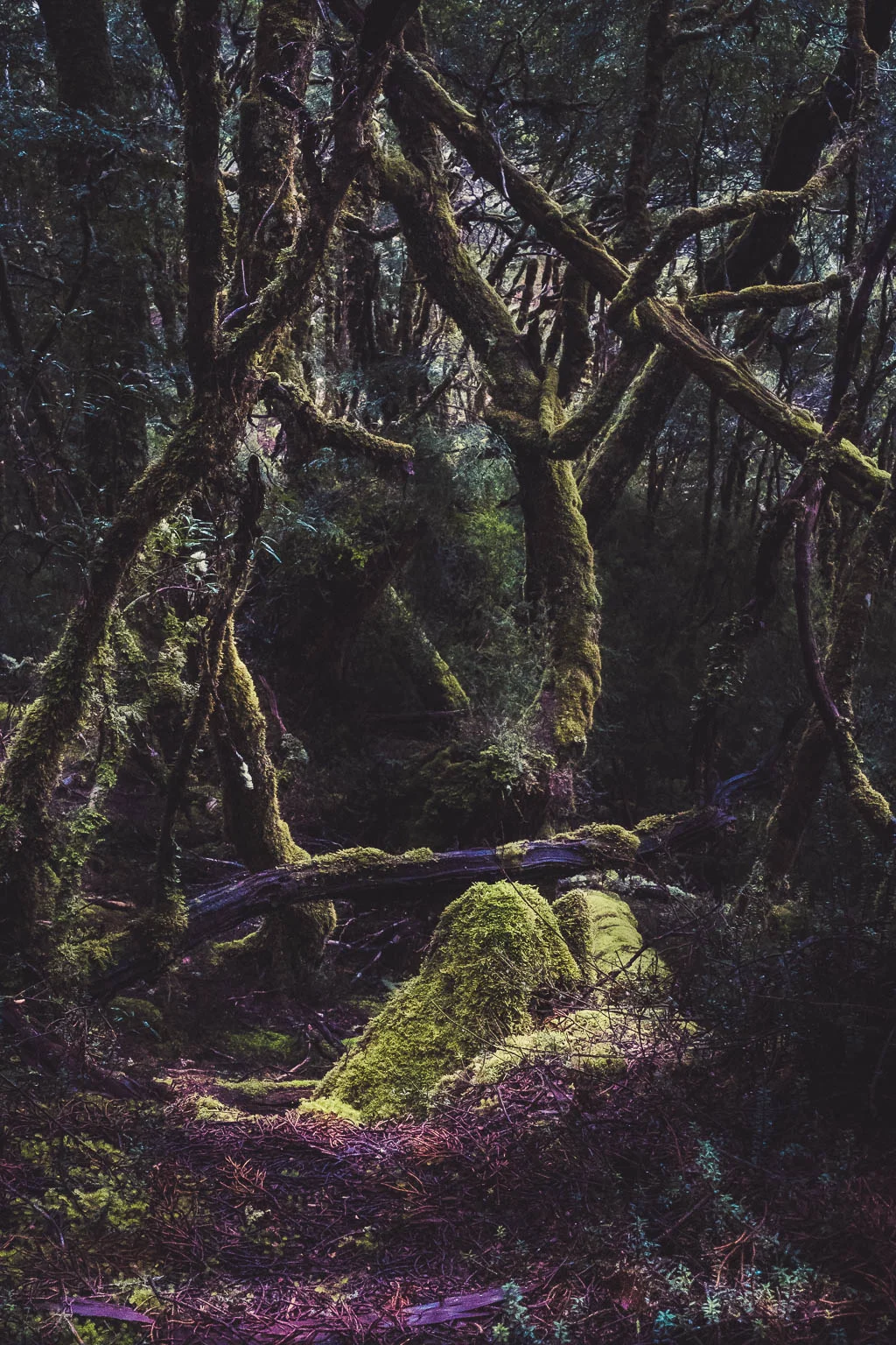
For the last 10 years I have been regularly visiting this remote and pristine island state. Tasmania is about a 1.5 hour flight from Sydney to the city of Launceston. The diverse choice of landscapes and close proximity by car make this a unique and accessible environment still largely untouched.
Tourism in Japan is growing, and fast. According to JNTO, the estimated number of international travelers to Japan in March 2018 was about 2.6 million (+18.2% from the previous year), making it the biggest March ever.
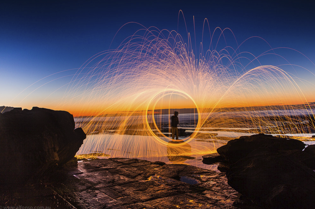
Often wondered how these rings of fire are done? They look spectacular but are they safe to make? Below are some tips on how to avoid accidental fires. Combined with a beautiful landscape at dusk or dawn you can capture similar images. All you need to do is look for the perfect location.
You won’t require a lot of expensive gear to photograph this spectacular light show. Everything you require is pretty much in or around your home. You will need a metal whisk, steel wool (zero grade), a dog leash or similar (preferably about one meter long) and a 9-volt battery or gas lighter.
Camera Gear
Grab your DSLR camera and preferably a fast wide angle lens (somewhere between 16 and 24mm works well). To keep your shots steady, use a sturdy tripod and a remote shutter release. Since you might be photographing at night or dawn you'll need a torch. A head lamp is ideal as it keeps your hands free to operate the camera.
A beach is a good location for this kind of shoot as it's normally quite easy to find a place on the sand or rocks that's well away from anything flammable.
Before you do anything, talk to your local council and fire brigade and let them know what you are doing, when and where. They may be able to offer guidance on the best time and place to shoot and additional safety precautions. Safety is paramount. Wear protective clothing and find a location that's well away from other people, animals and potential fire hazards (eg. shrubs, trees, grass, leaves, etc...). Do not shoot in windy conditions and do not shoot if there are local fire warnings in place.
Set your camera to manual mode and take a few shots to establish how bright any ambient light in the sky might be. Typically I set my camera to an ISO of 100 or 200, with an aperture of f/8 to f/11, and a shutter speed between 20 and 30 seconds. In the menu settings on your camera there should be an option to turn noise reduction (NR) off. If NR is on it chews up lots of battery and takes double the time to review your photos. You're much better off shooting in raw mode and applying noise reduction in post-production. Shooting raw will also help you capture more detail and give you more flexibility to adjust variables such as white balance, exposure and contrast later on.
Place the steel wool inside the metal whisk and gently spread it out. (By pulling the steel wool apart you maximize airflow and ensure a longer lasting effect.) Attach the whisk securely onto the long dog leash and hand it over to your trusty assistant. Remember, the person spinning the whisk must be wearing protective clothing. Dark colors are ideal as they will conceal the person spinning the whisk. Make sure that your subject is standing in a clear space and when you're ready have them light the steel wool, with the lighter or the 9-volt battery (rub the battery's contact points on the steel wool). Experiment with different spinning the whisk speeds, patterns and camera settings to get the effect you're looking for. In no time you will be capturing amazing light shows of your own.
Do you have any other suggestions? Do you have any similar photos you wish to share? Do you have any stories to tell about your experience doing a ring of fire?
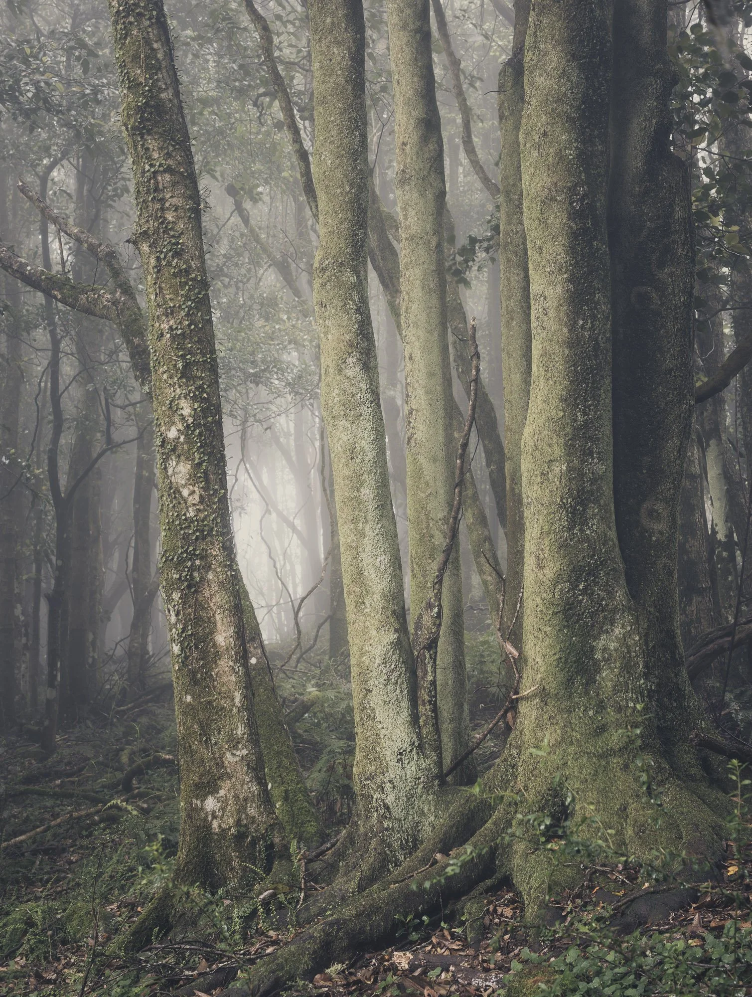
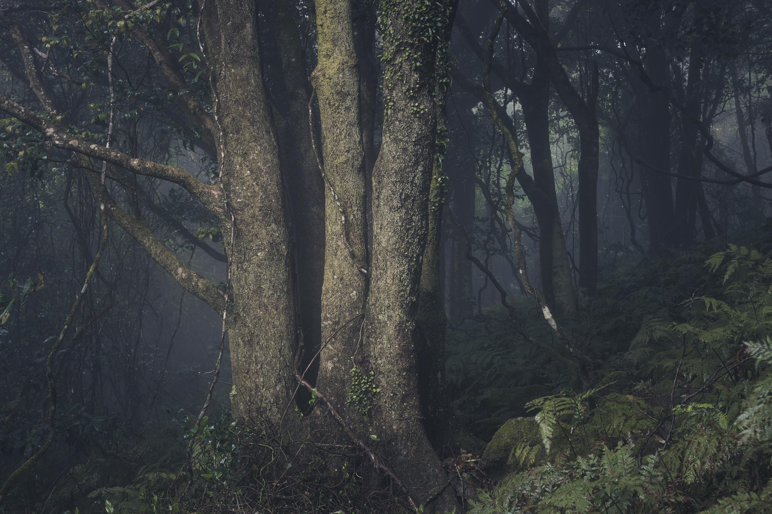
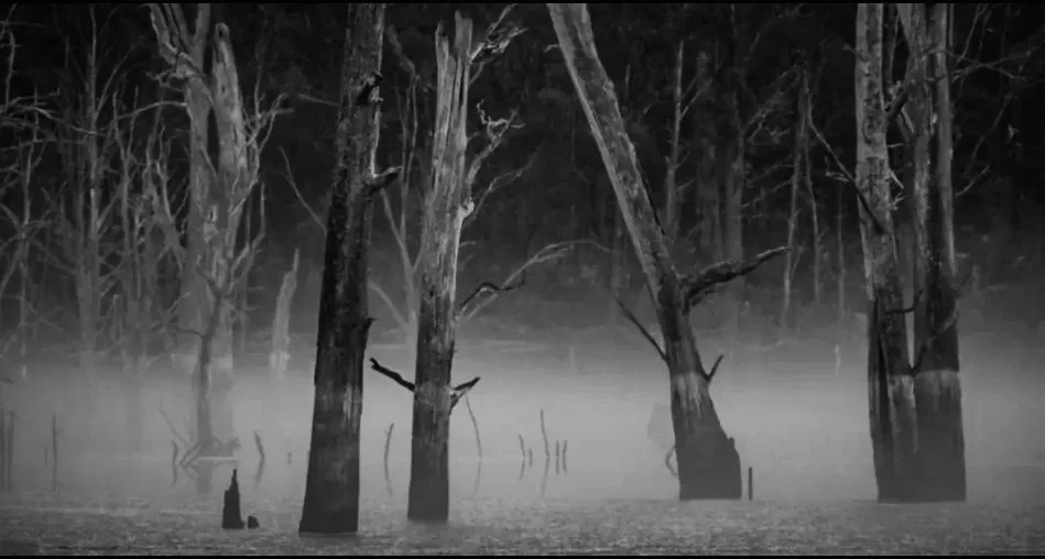
Foggy Forest Blue Mts
Finding order in the chaos of a forest has always been a struggle but finally I have honed in on some simple steps to get me closer to finding the best shot. Without sounding too prescriptive, the method to my madness needs to be fluid and open to change. Sometimes adding constraints within a loose parameter, you can create something visually satisfying.
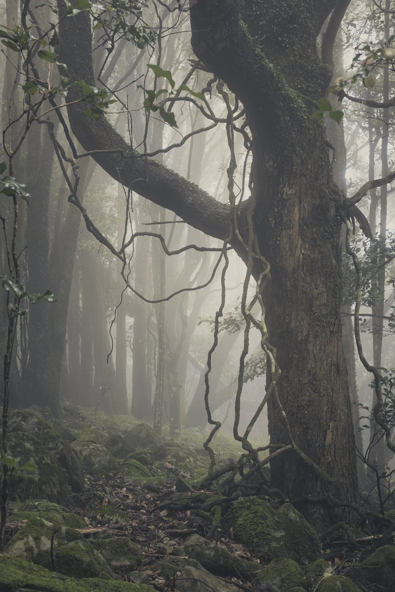
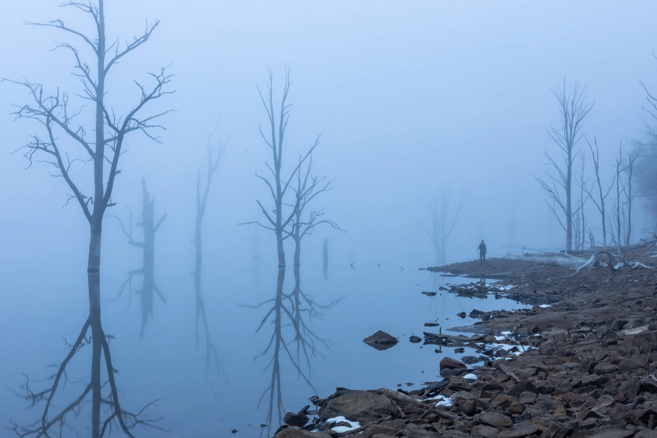
Forest Bathing 1
Overcast days, fog and rain are my best friends in the forest. Walking to the edge of a forest where the light is coming from will help target a cluster of trees or a single beauty. An image will be more impactful if you avoid including the sky especially when blown out highlights appear. The viewers eyes are usually attracted to bright or white areas. When they appear on the edge of the frame and detract us from the dominant areas then our focal point can be lost in the sauce.
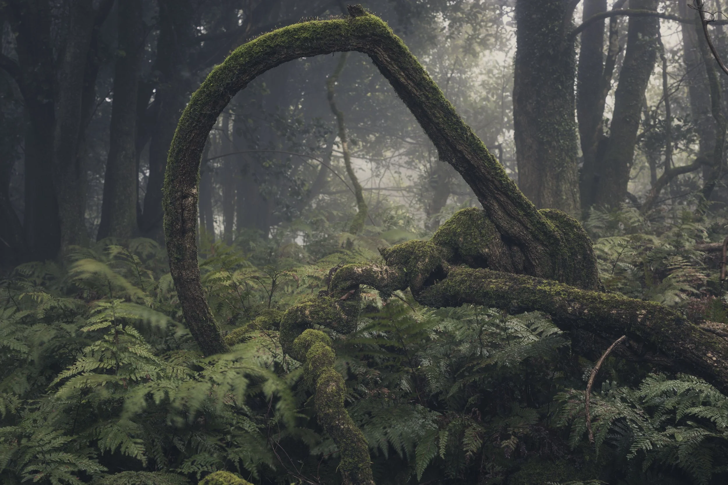
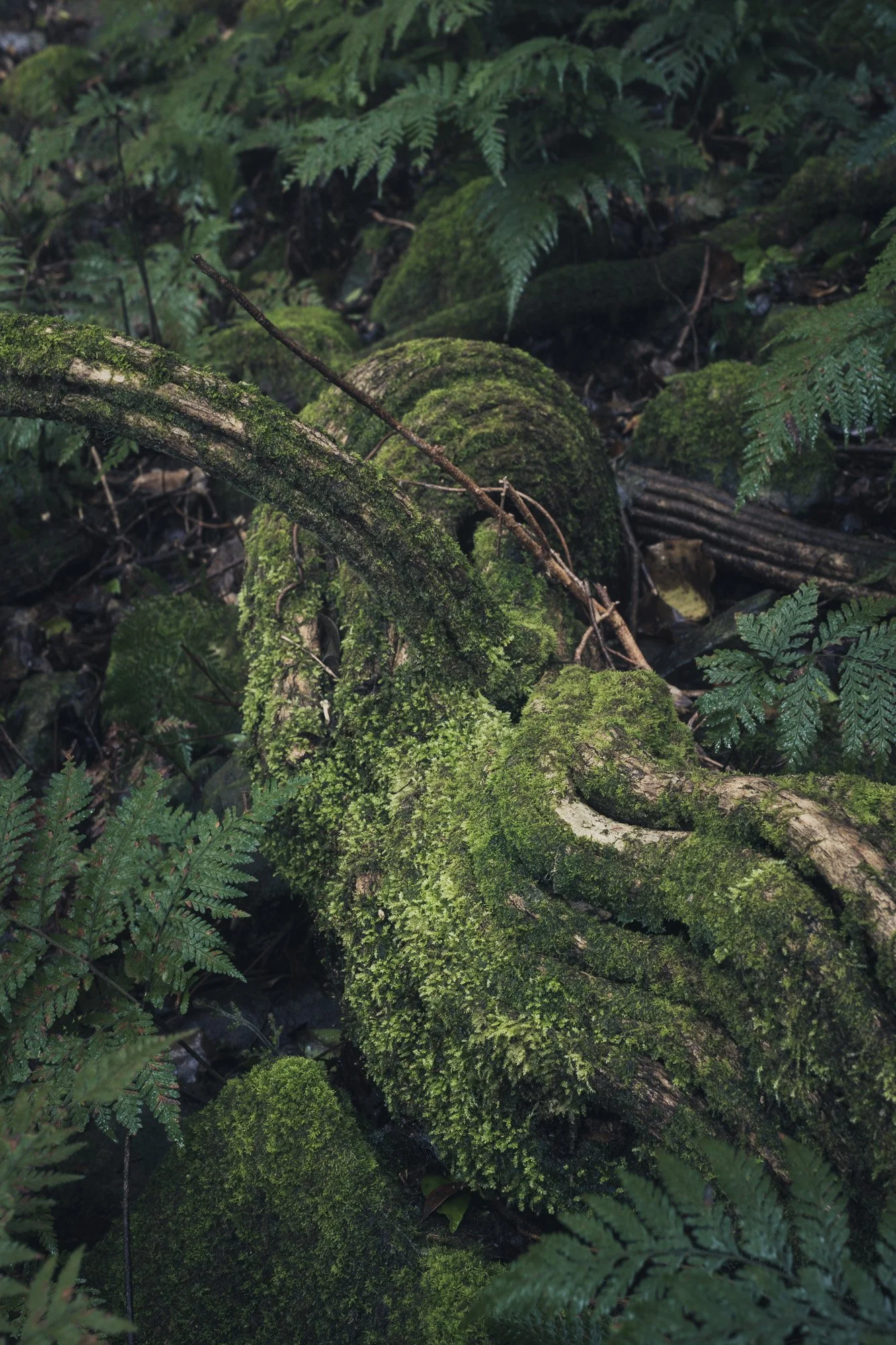
Forest Bathing 2
Repetition: Lines straight or curved are always a stand out in forest photography. Juxtaposition of those lines as a focal point are a key element to adding depth throughout the image. Always look behind the main subject and check if there are any conflicting lines.
Texture: the rough tactile nature of the forest shines brightly in its tree trunks most often. The smooth leaves and fog can also add a welcoming contrast to the weight of the image.
Contrast: The transitions in the light and dark and warm and cool temperatures can add mystery and drama to the image.
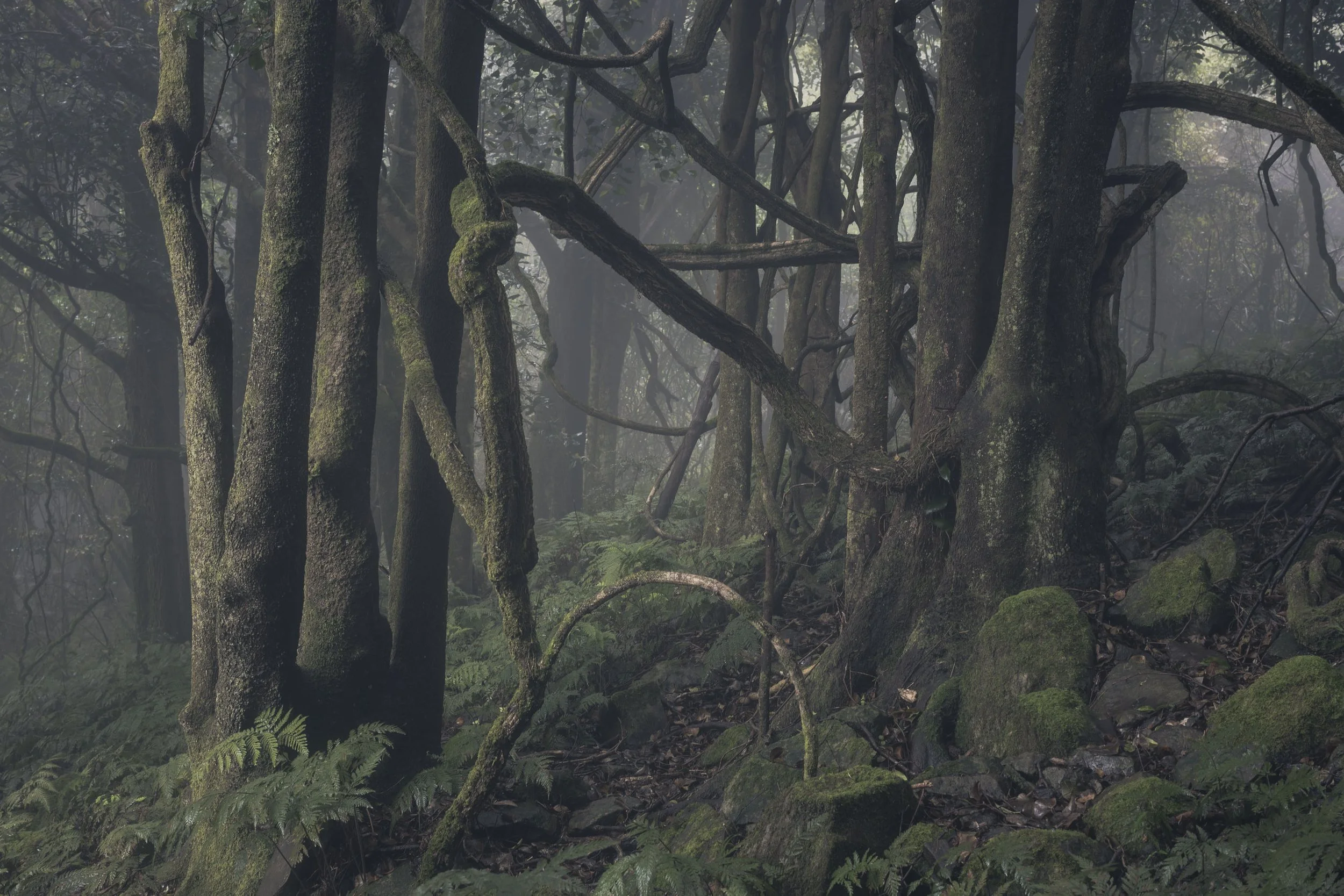
Forest Bathing 3
Tripod: Sturdy, Tall and Lightweight
Lens: 35-50 MM (F1.2)
Wet Weather: Golf Umbrella, Small Towel, Raincoat, Mr. Bushman (Leech Bite) or Salt, Spiked Water Proof Boots.
Forest Bathing 4
ISO: 50 / Aperture: F11 / Shutter Speed: 3.2 seconds / Self TImer: 2 Secs / Auto White Balance
File Type: RAW / Focus Points: 3 areas ( Foreground, Mid-ground and Background)
Auto Exposure Bracketing: +/- 1 stop
Enable Touch Screen Focus & Shutter (Live View)
Forest Bathing 5
Software: Photoshop & Lightroom
H.D.R. Blend of best bracketed exposures in Lightroom
Focus Stack: Greater Depth of Field focus in Photoshop
Masking: Adobe Lightroom Brush Tool
Colour Grading: Split Toning
Forest Bathing 6
In this series of images I call “Forest Bathing” also known in Japanese as “Shinrin Yoku” I have found some peace and tranquility when spending time in the forest. Despite the occasional leech bite, the rewards far out weigh the scars.
All images for sale here: https://www.alfonso.com.au/art-shop
Wish to join me in 2026/2027 in Japan (Nov) NZ (Sept) NSW (July/Aug)
More info here: https://www.alfonso.com.au/photo-tours
Alfonso’s Photo Tours
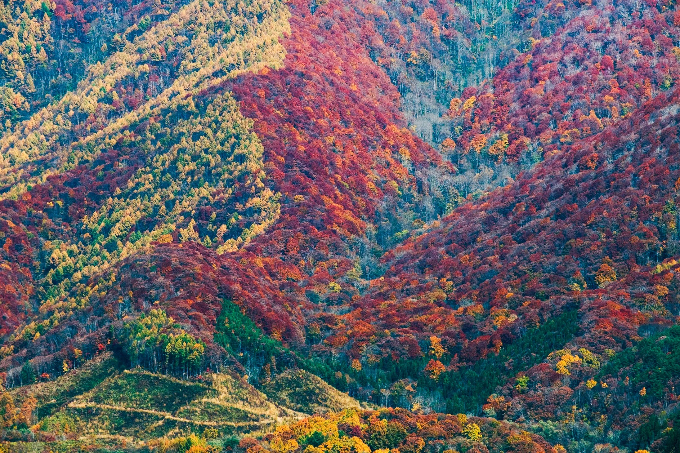
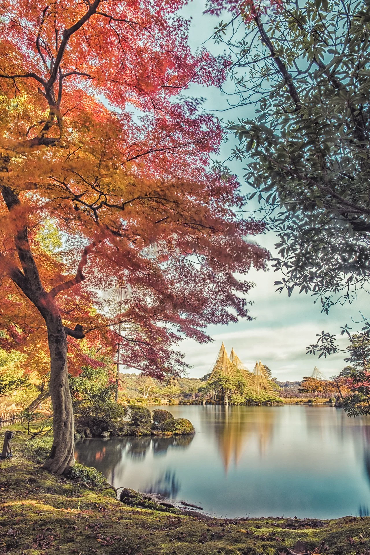
Japan is often cited as having some of the most vivid and diverse autumn colors (known as koyo) in the world. While North America is famous for its vast forests of red and gold, and Europe is known for its rolling yellow landscapes, Japan’s foliage is unique due to a combination of botany, climate, and geography.
Tohoku Region, Japana
1. Massive Species Diversity
Japan has an incredible variety of deciduous trees compared to other regions like Europe.
**The "Momiji" (Japanese Maple): Japan is home to over 25 species of maple trees. The Japanese Maple (Acer palmatum) is genetically predisposed to turn a deep, brilliant crimson that is often more intense than the reds found in other parts of the world. Mixed Forests: About 70% of Japan is mountainous and forested. These forests are a mix of broad-leaved deciduous trees (reds and yellows) and evergreens, which provides a high-contrast backdrop that makes the colors "pop" more than a monochrome forest.
Kawaguchiko, Mt. Fuji
2. The "Perfect" Autumn Climate
The vibrancy of a leaf's color is determined by the synthesis of anthocyanins (red pigments). Japan’s climate is perfectly tuned for this. Sharp Temperature Spikes: For the best reds, you need warm, sunny days followed by crisp, cold nights (around 5°C to 7°C). Japan’s mountainous geography creates these dramatic daily temperature swings.
High Humidity and Rainfall: Japan’s rainy summers ensure trees are healthy and hydrated. If a region is too dry, leaves often turn brown and fall off early; in Japan, they stay on the branch longer, allowing the colors to fully saturate.
Goshiki-Numa Ponds, Fukushima
3. Geographical "Stretching"
Japan is a long, narrow archipelago stretching from North to South. This creates a "front" of autumn colors that moves slowly down the country over about 90 days. Because of the varying altitudes and latitudes, you can find peak foliage somewhere in Japan from late September (in Hokkaido) all the way until early December (in Tokyo/Kyoto).
Goshiki-Numa, Fukushima
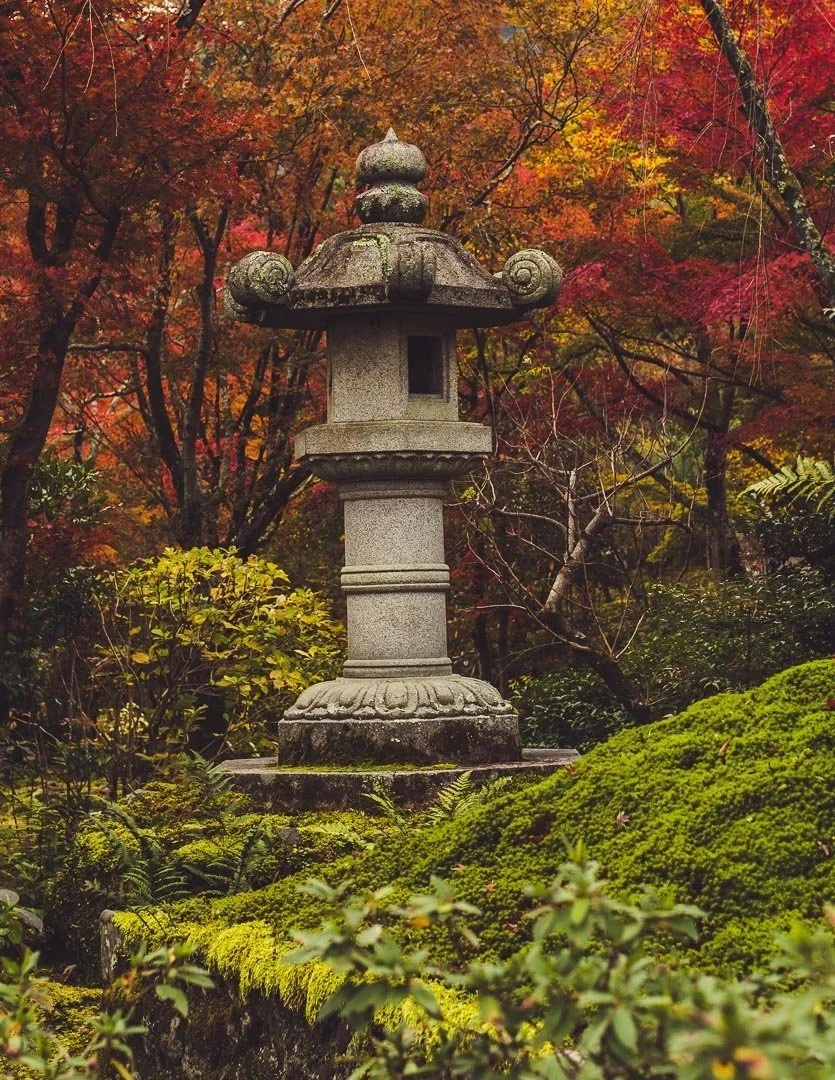
4. Cultural Preservation and Curation
In Japan, autumn color is not just a biological event; it is a curated experience.
Temple Landscapes: For centuries, monks and gardeners have strategically planted trees around temples and shrines to frame specific views. The juxtaposition of a neon-red maple against a dark wooden temple or a mossy green garden creates a visual intensity that you don't typically find in wild, unmanaged forests.
Arashiyama, Kyoto
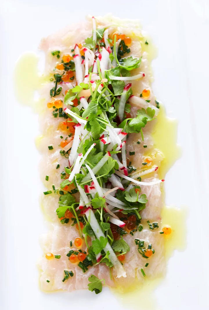
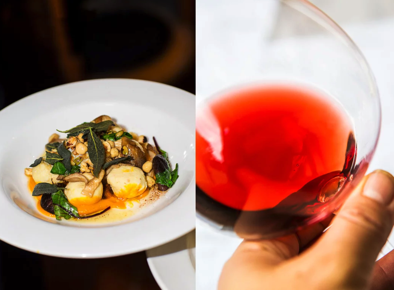
While professional food photography is often done in studios with elaborate lighting set-ups, you can get some amazing results using diffuse natural daylight. Avoid direct sunlight and use a reflector to bounce light into the shadow areas of your dish. Pay close attention to detail especially in the shadow areas and be careful not to blow out your highlights – especially in the food itself. A simple piece of white paper can make for an inconspicuous reflector in a restaurant environment. If you have to shoot at night, try to avoid using on-camera flash if at all possible. A pocket-sized tripod can be used to keep the mobile camera stable.
02 WHICH LENS?
Most new mobile phone cameras have 2-3 lenses that are marked as 0.5 / 1x / 2x magnification. I would suggest you avoid the 0.5 unless you are after a slightly distorted and wide angle view. 1 or 2x magnification mimics closely a typically used 50mm lens. Avoid pinching and zooming past your longest lens as it will be a digital not optical zoom. Your image quality will be lessened greatly.
The expression 'keep it simple' is worth keeping in mind when it comes to composition. Try to avoid putting anything in the frame that distracts from the main subject. Move the camera angle up and down to find the perspective that makes the food look the most delicious. A top-down view can look great but a 45-degree angle tends to add a more dynamic feel.
Using a wide aperture to produce a narrow depth of field can be a useful way to minimise background clutter and put the emphasis on the food. Be careful though to make sure that there is plenty of detail in the areas that matter. The portrait filter on your mobile camera throws on a shallow depth of field filter. I would suggest you use snapseed’s (editing tool) to have much more control of lens blur. Sometimes it will be good to blur the background to atrract the viewers eyes more to the main subject.
Clean white plates on clean white backgrounds have been popular in food photography for a while. It's a style I like, as you can see from the images that accompany this story, but it's not the only option. If you are going to include a background with some more detail try to include elements that expand on the story of the food. Developing your own signature style over time or curating backgrounds and props to suit the food more appropriately will help enhance the food experience. I would keep it simple have 3 foregrounds, 3 different types of plates and 3 backgrounds that way you chop and change to match the feel and colours and textures. of the food.
This is a complete subject in its own right and the people who are good at it have been doing it for years. If you are arranging the food yourself make sure everything on the plate looks fresh and delicious. A chef mate once told me that placing all the food elements on a plate should not take more than five movements. The less you move the elements around, the more naturally they will fall into place. Try to include a mix of shapes, sizes, colours and textures on the plate.
Once you have photographed your best images we will then open them up in a free app called snapseed. The most common tools to be used will be Tune Image, White Balance, Brush, Tonal Contrast and Lens Blur. The best approach to editing is to take a more local not global approach. Much like great food, marinating your images will also give you perspective over time.
Other Great Reference ideas to improve on food photography:
https://www.pinterest.com.au/phototours/food-art/
https://mylucie.com/2019/11/29/behind-the-scenes-with-useyournoodles/
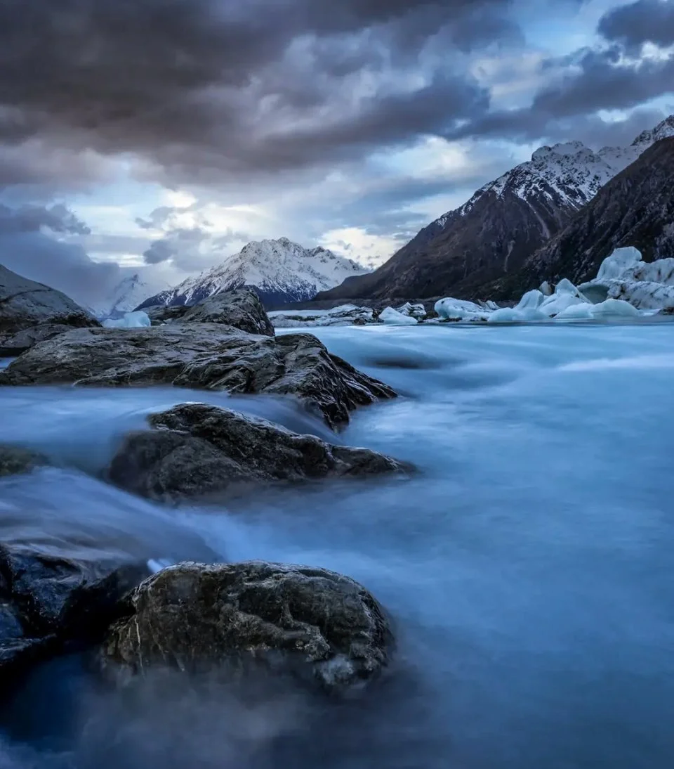
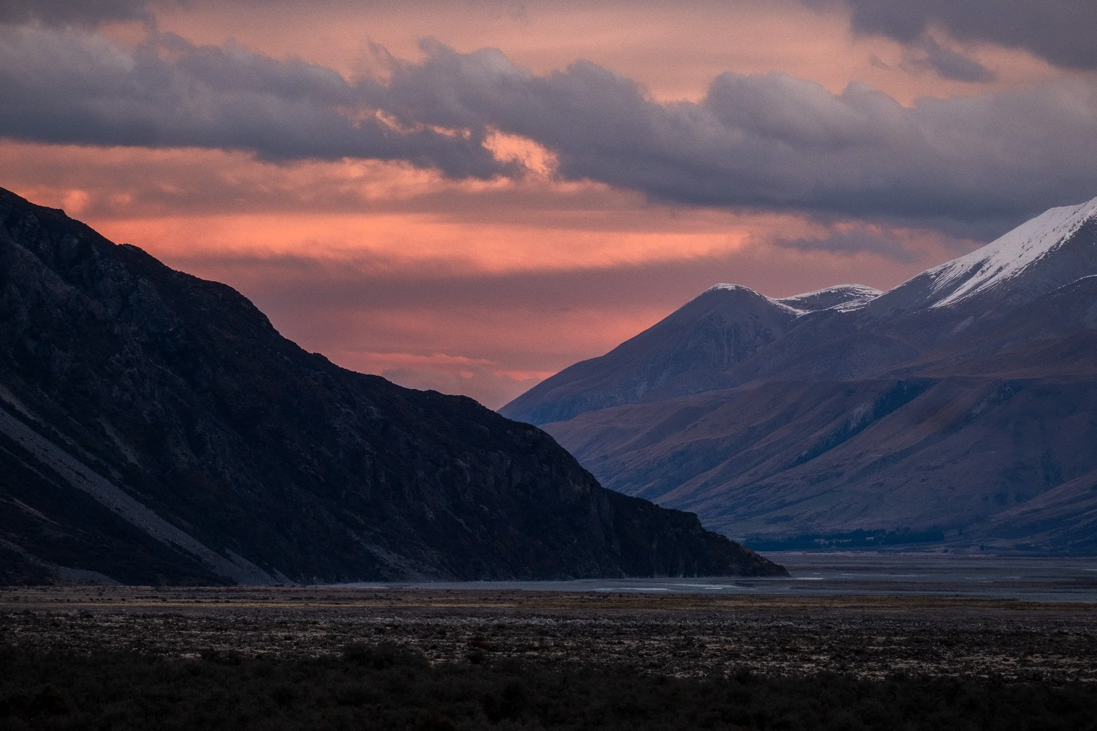
Tasman Glacier View, Mt. Cook Aoraki National Park, NZ
Image design is the "language" of photography. Think of the elements as your vocabulary (the building blocks) and the principles as your grammar (how you organise them). Even with the best gear, mastering these is what turns a standard photo into art.
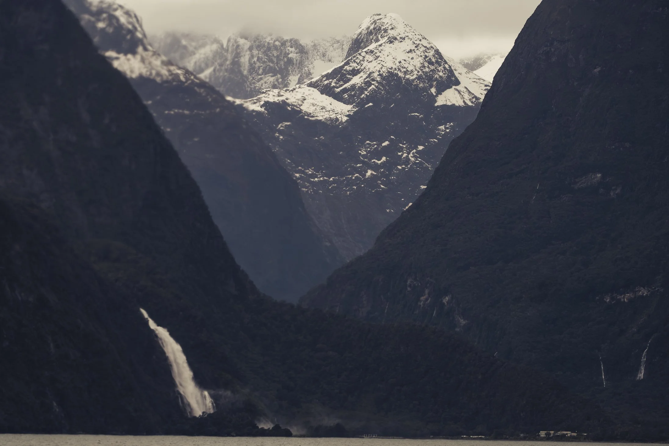
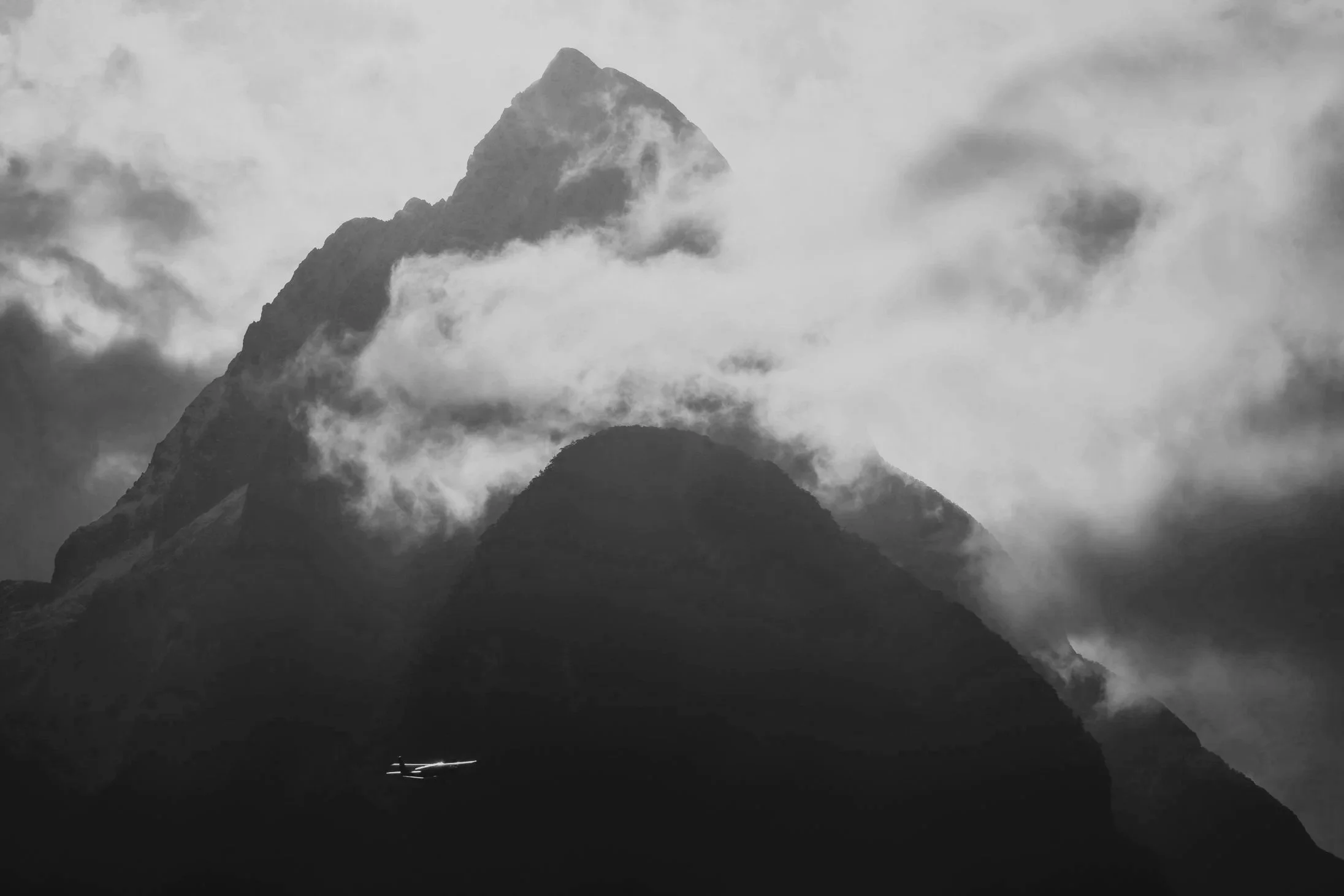
Milford Souind, New Zealand
The Elements (The Components)
These are the physical objects and qualities you arrange within your frame:
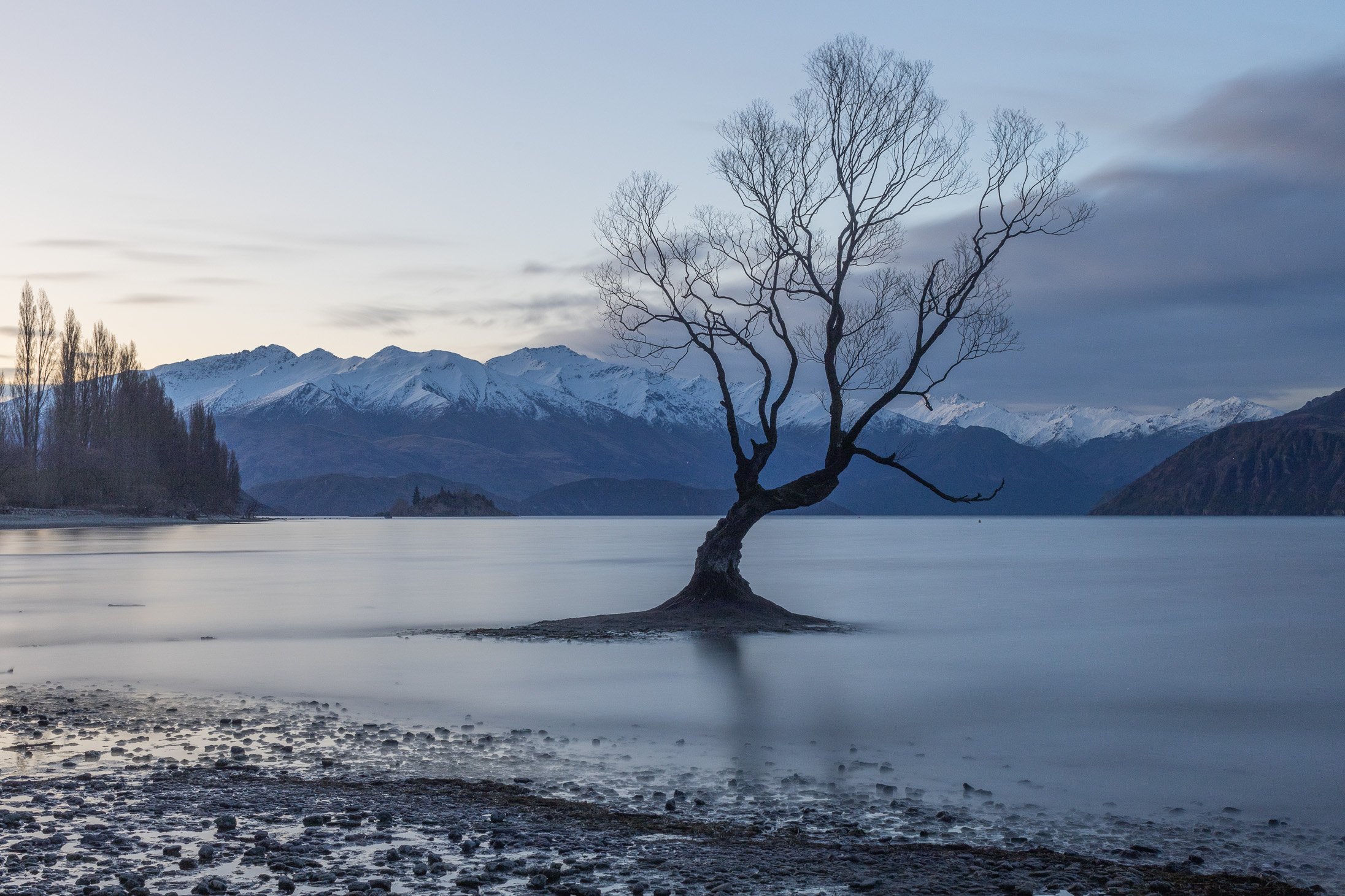
Wanaka Tree, New Zealand
Line: Marks that connect two points. They define shapes, create moods (called "character lines"), and lead the viewer’s eye.
Horizontal: Calm and restful.
Vertical: Strong; suggests height and stability.
Diagonal: Dynamic; suggests movement or tension.
Curvy/Jagged: Can express emotions like grace or anger.
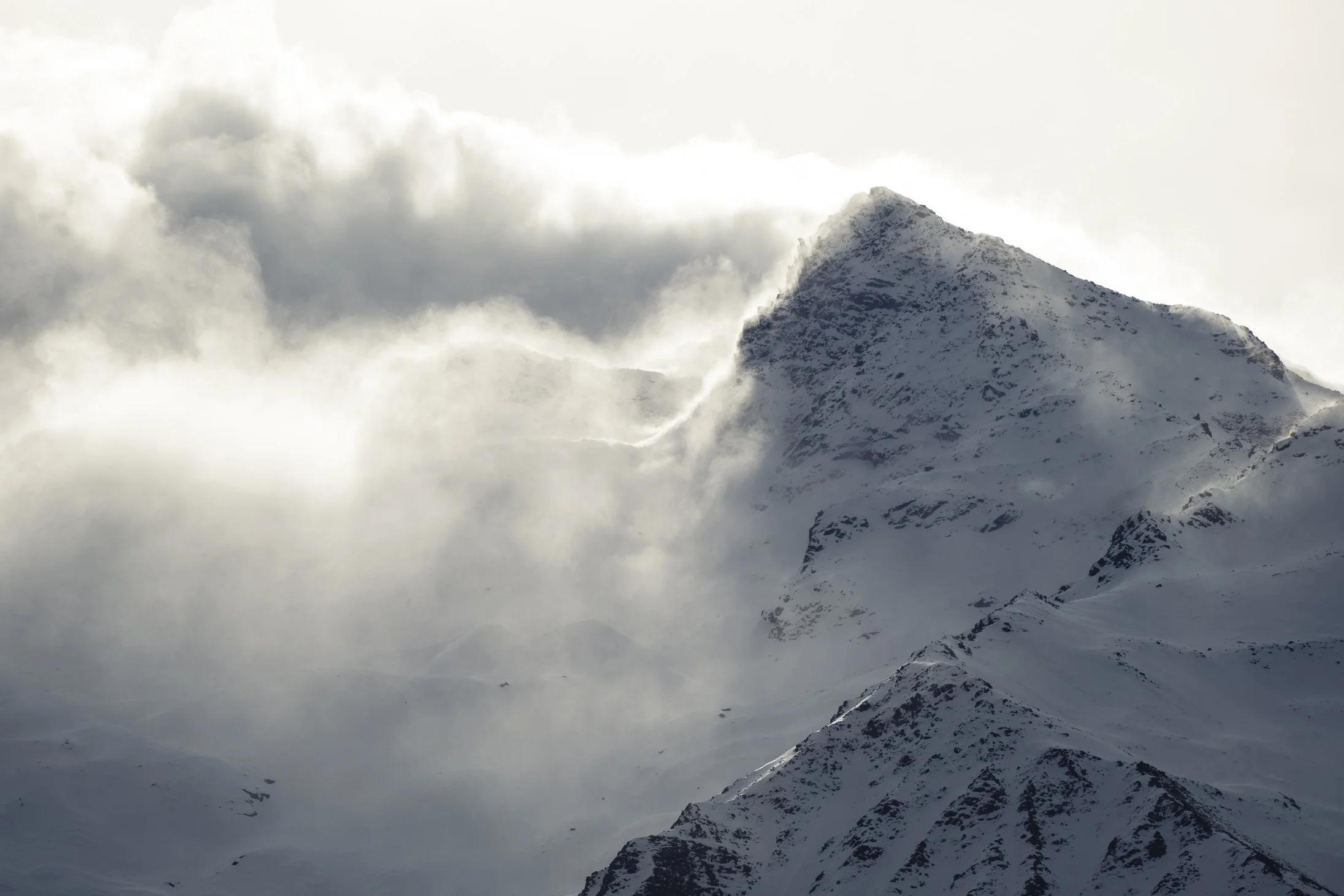
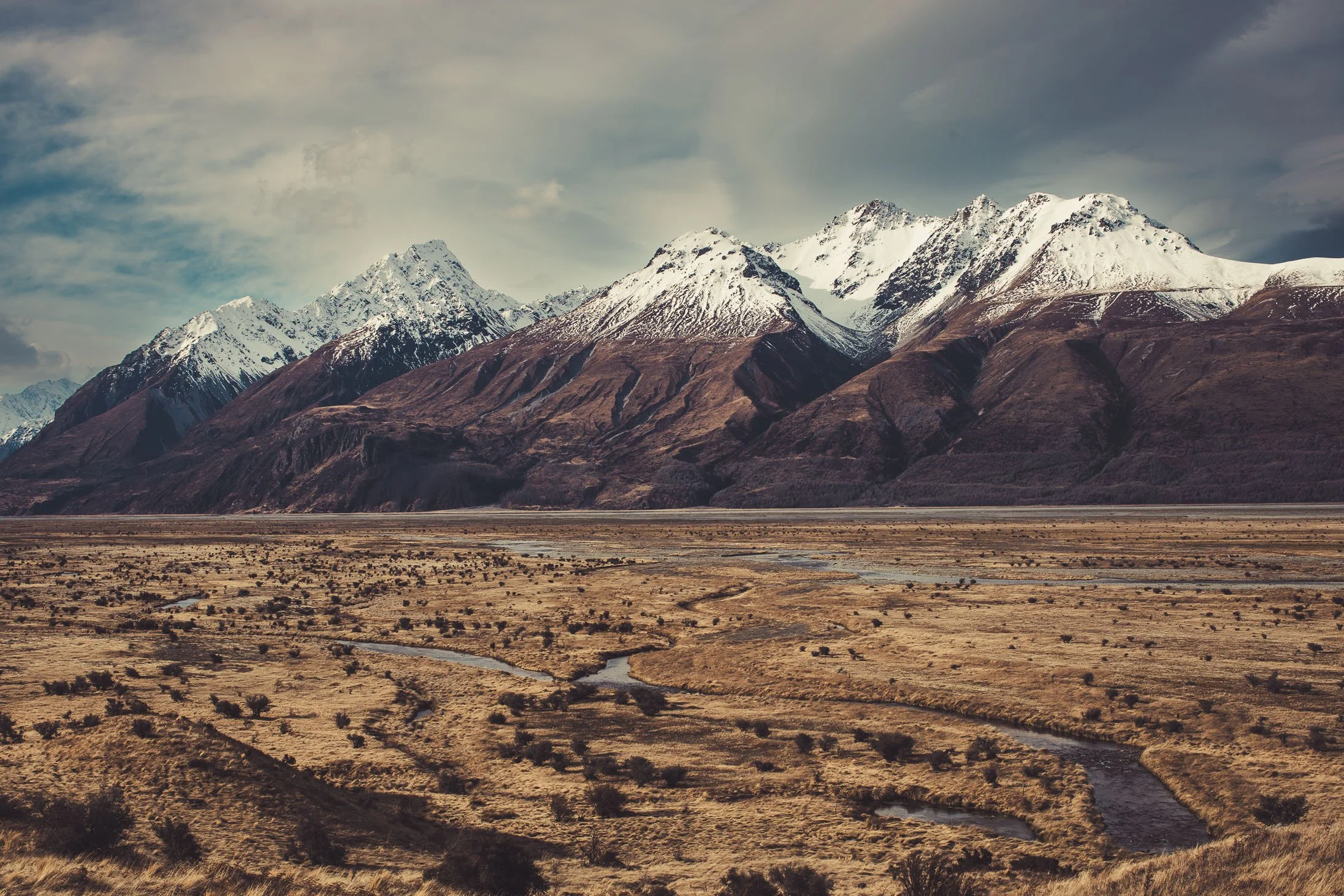
Mt Cook Aoraki National Park, New Zealand
Shape: 2D areas created by lines or colour blocks.
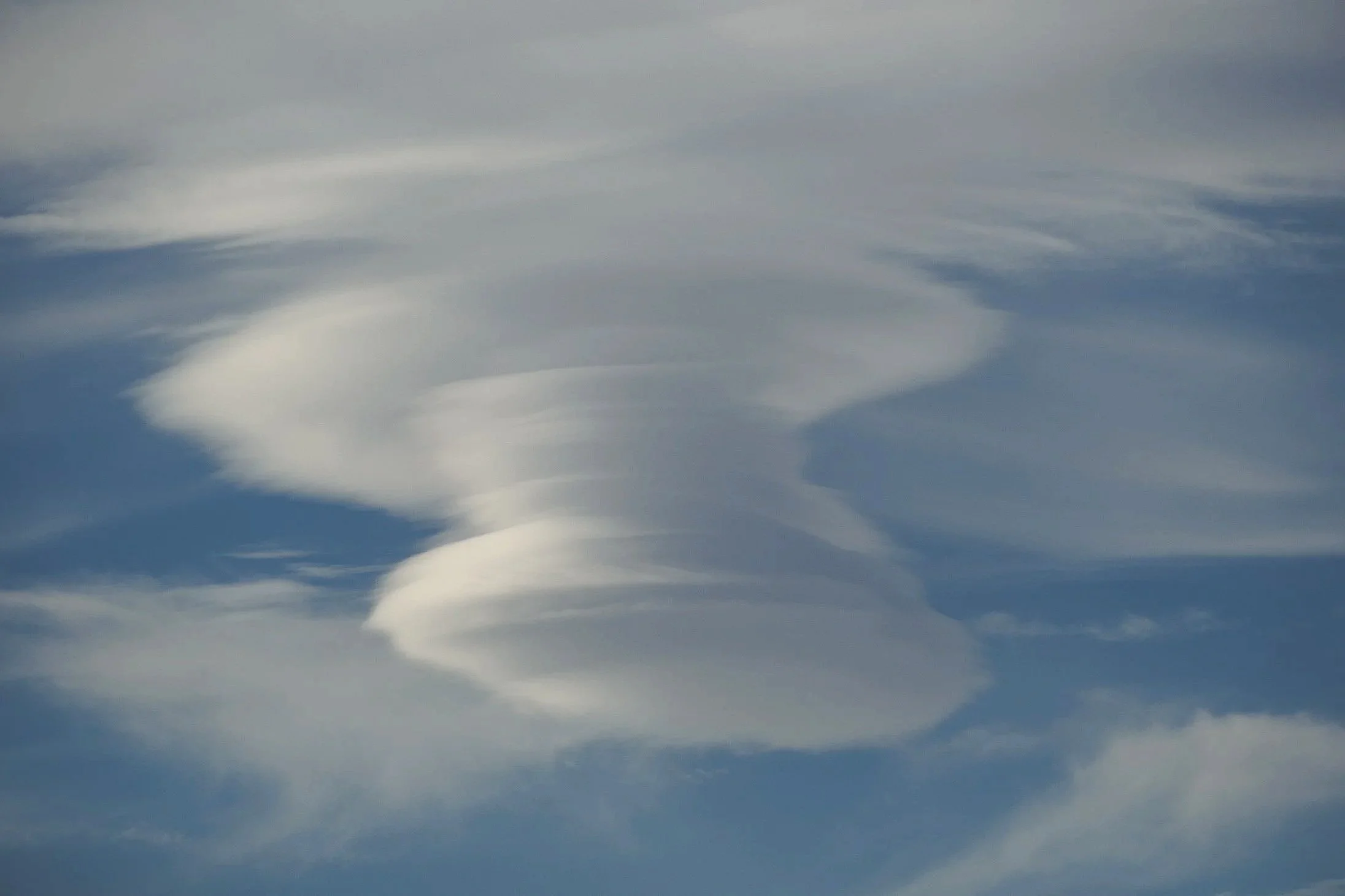
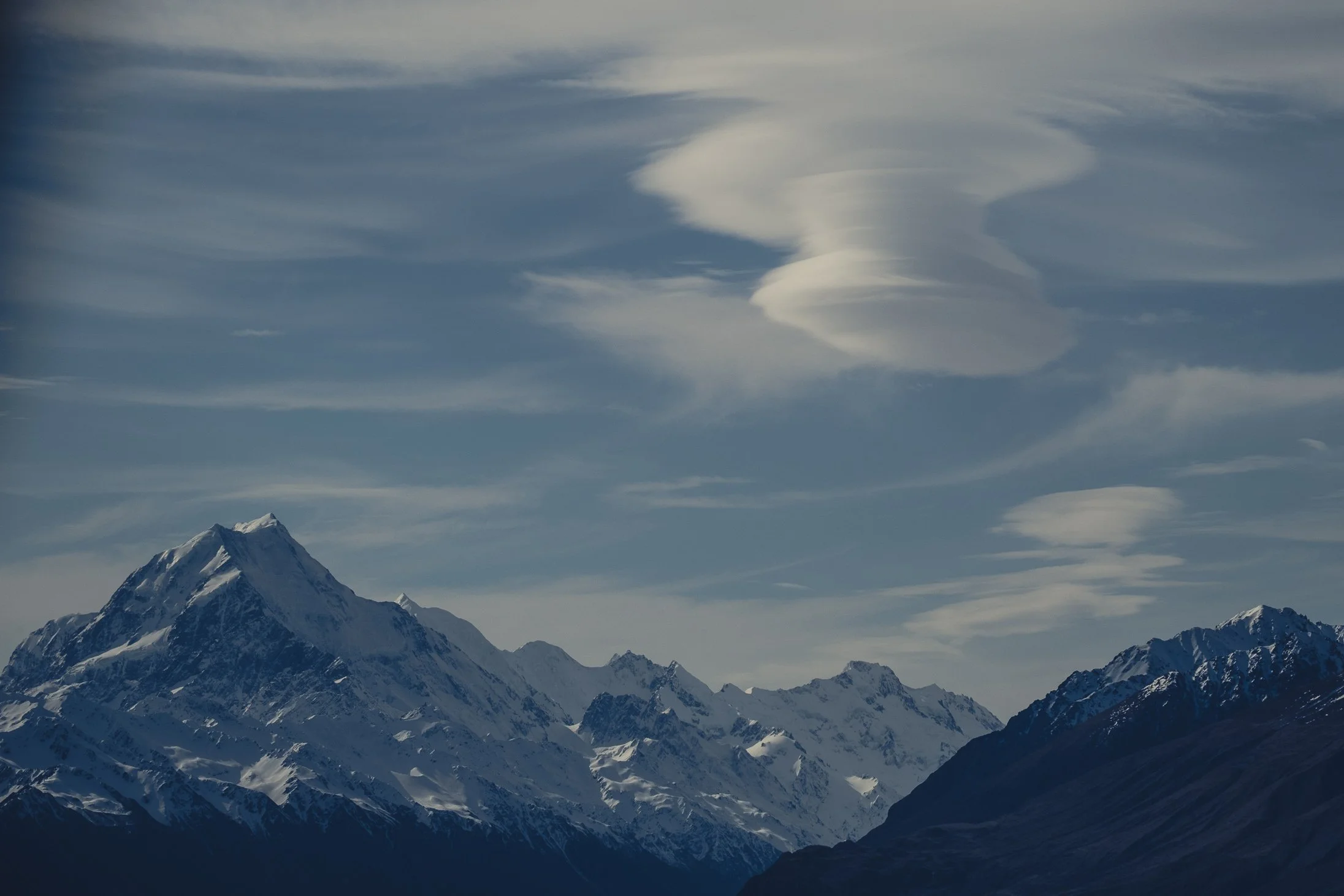
Lenticular Cloud, Mt Cook Aoraki National Park, New Zealand
Form: 3D depth (real or implied).
Mt. Cook N.P.
Space: The area around or between subjects.
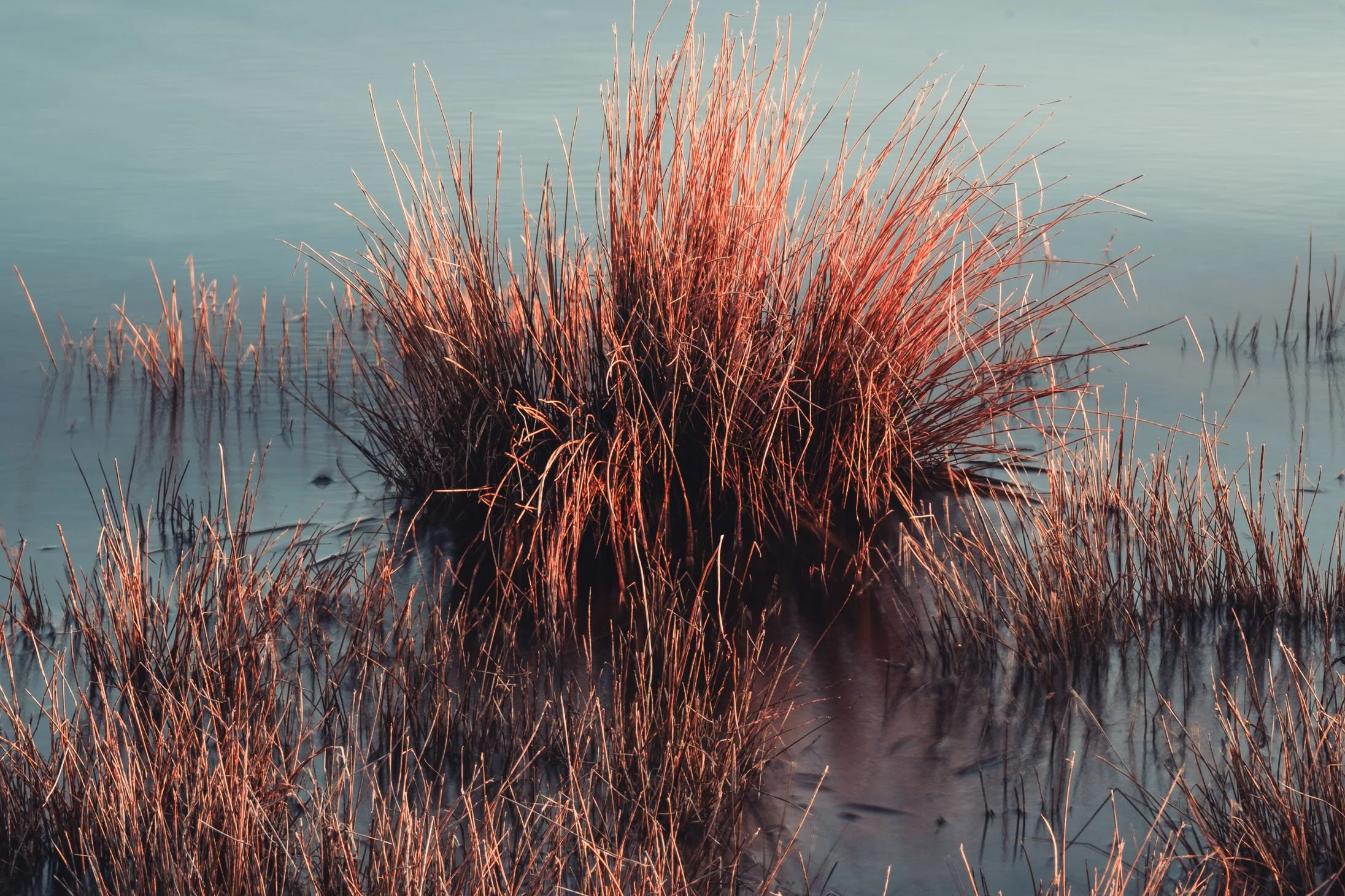
Grasses Mt Cook Aoraki National Park, New Zealand
Texture: The surface quality (rough, smooth, etc.).
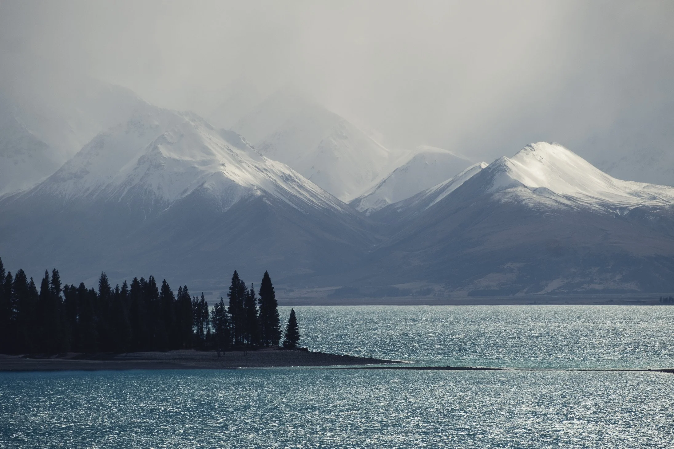
Lake Tekapo, New Zealad
Tone: The range of light and dark (contrast)
Mt Cook Aoraki National Park, New Zealand
The Principles (The Structure)
These are the rules used to organise the elements. How you apply them determines the message and emotional impact of your work
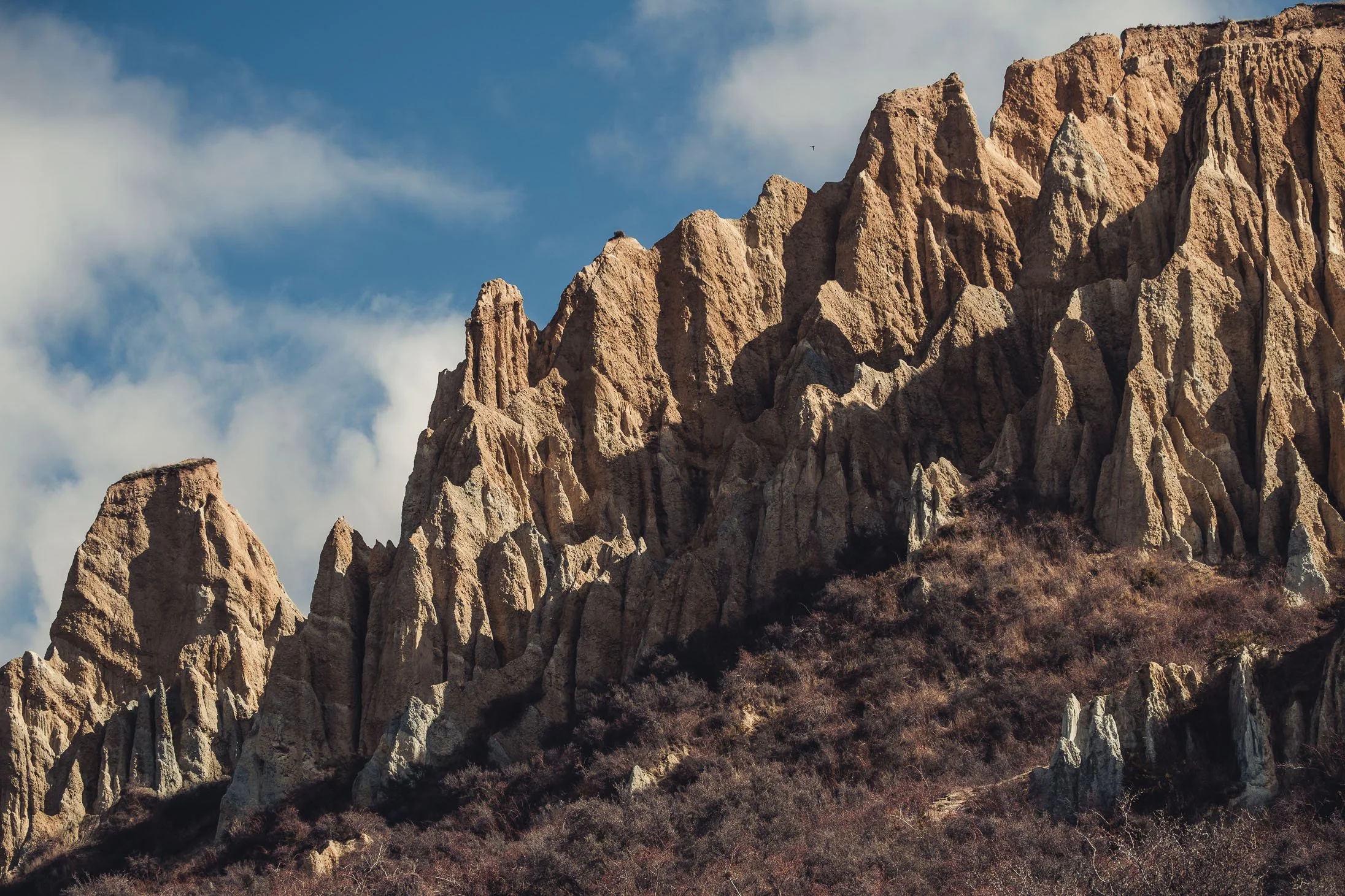
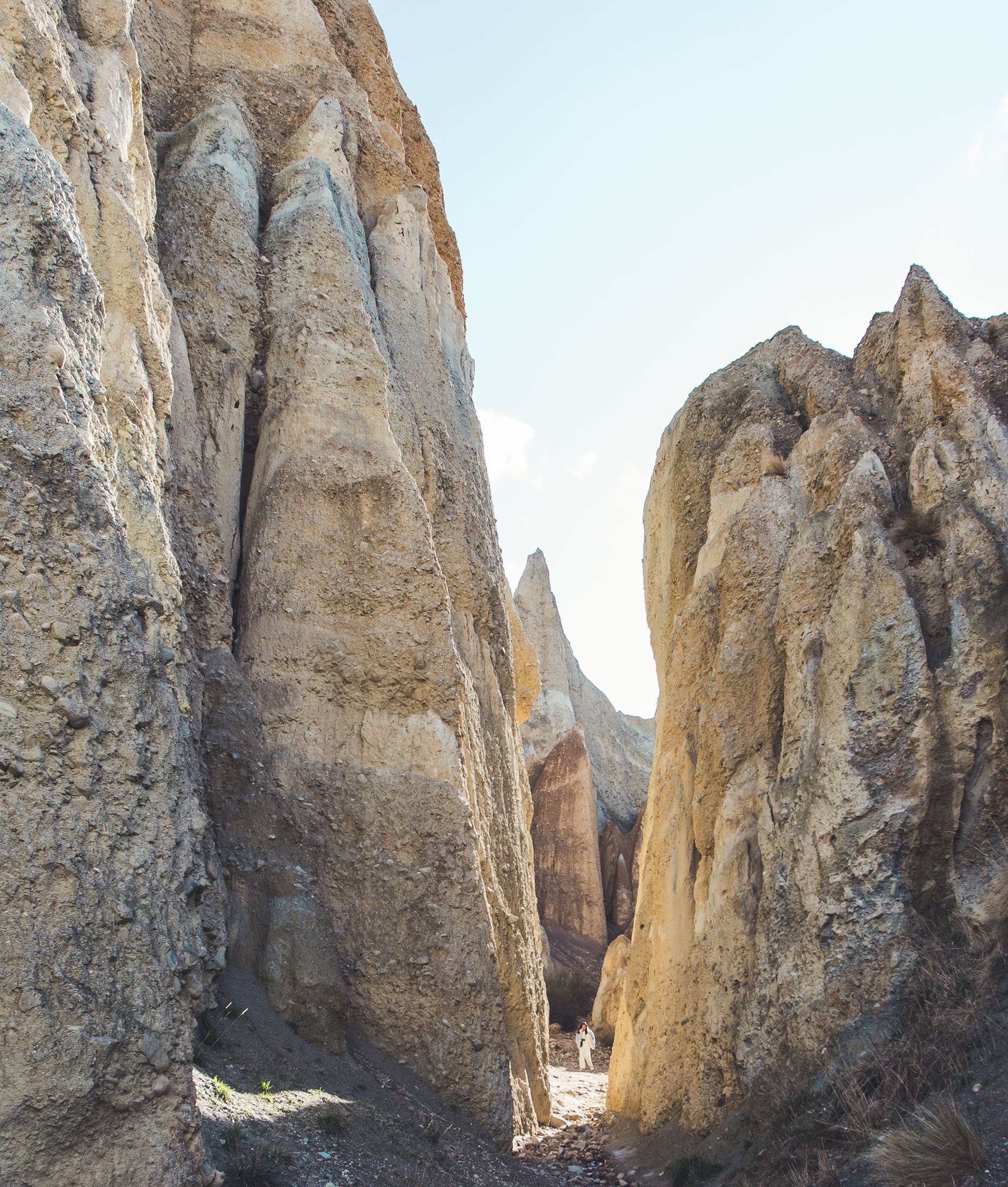
Clay Cliffs, New Zealand
Balance
Balance is the distribution of "visual weight" (lines, shapes, and forms) to create equilibrium.
Symmetrical: Identical forms on both sides of a central axis.
Asymmetrical: Different objects arranged so their varying visual weights still feel balanced.
Repetition & Rhythm
These create a visual "beat" for the eyes to follow.
Repetition: Using the same elements (shapes, colours, lines) multiple times.
Rhythm: Organizing those repeated elements into a specific pattern or order.
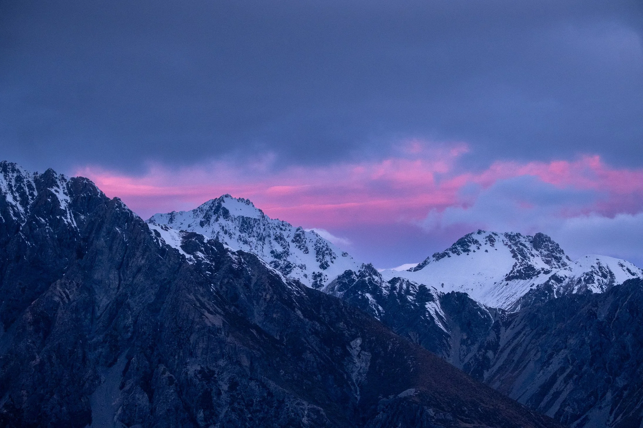
Milford Sound, New Zealand
Dominance (Focal Point)
This makes one part of the image more important than the rest using size, colour, or position.
Focus: It creates a center of interest where the eye naturally returns.
The Rule of Three: Limit yourself to three (or fewer) dominant points to avoid confusing the viewer.
Contrast
Contrast is the "Yin & Yang" of design—using opposites to create interest.
Examples: Light vs. dark, large vs. small, or rough vs. smooth.
Proportion: The scale relationship between different elements helps establish this variety.
Mt Cook Aoraki National Park, New Zealand
Unity (Harmony)
Unity is the "glue" that pulls all elements together into a single, cohesive message or theme.
Consistency: Each part must relate to the whole.
Result: When nothing distracts from the overall purpose of the image, you have achieved harmony.
Clay Cliffs, NZ
Milford Sound
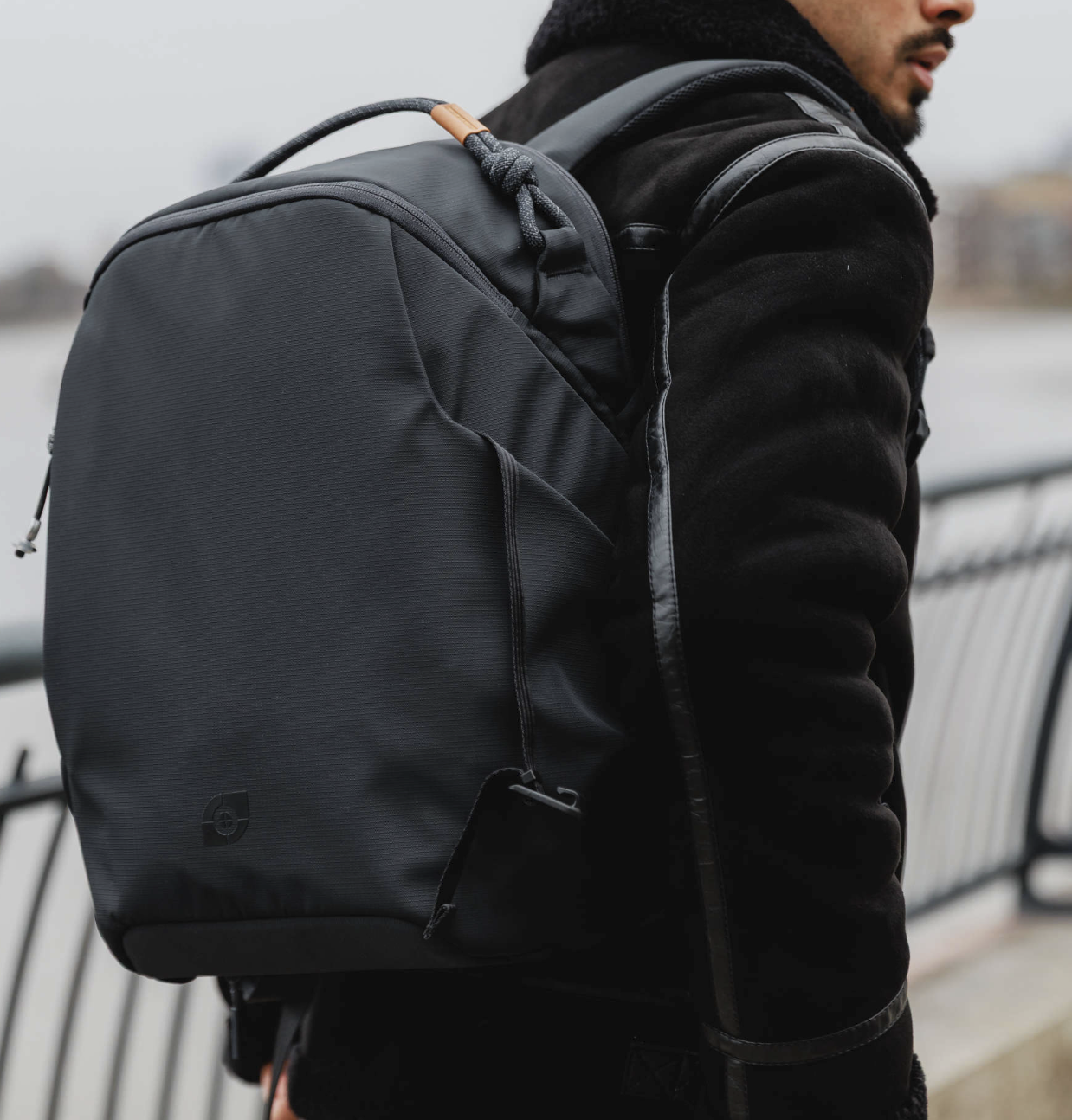
My Favourite Travel Caamera Bag
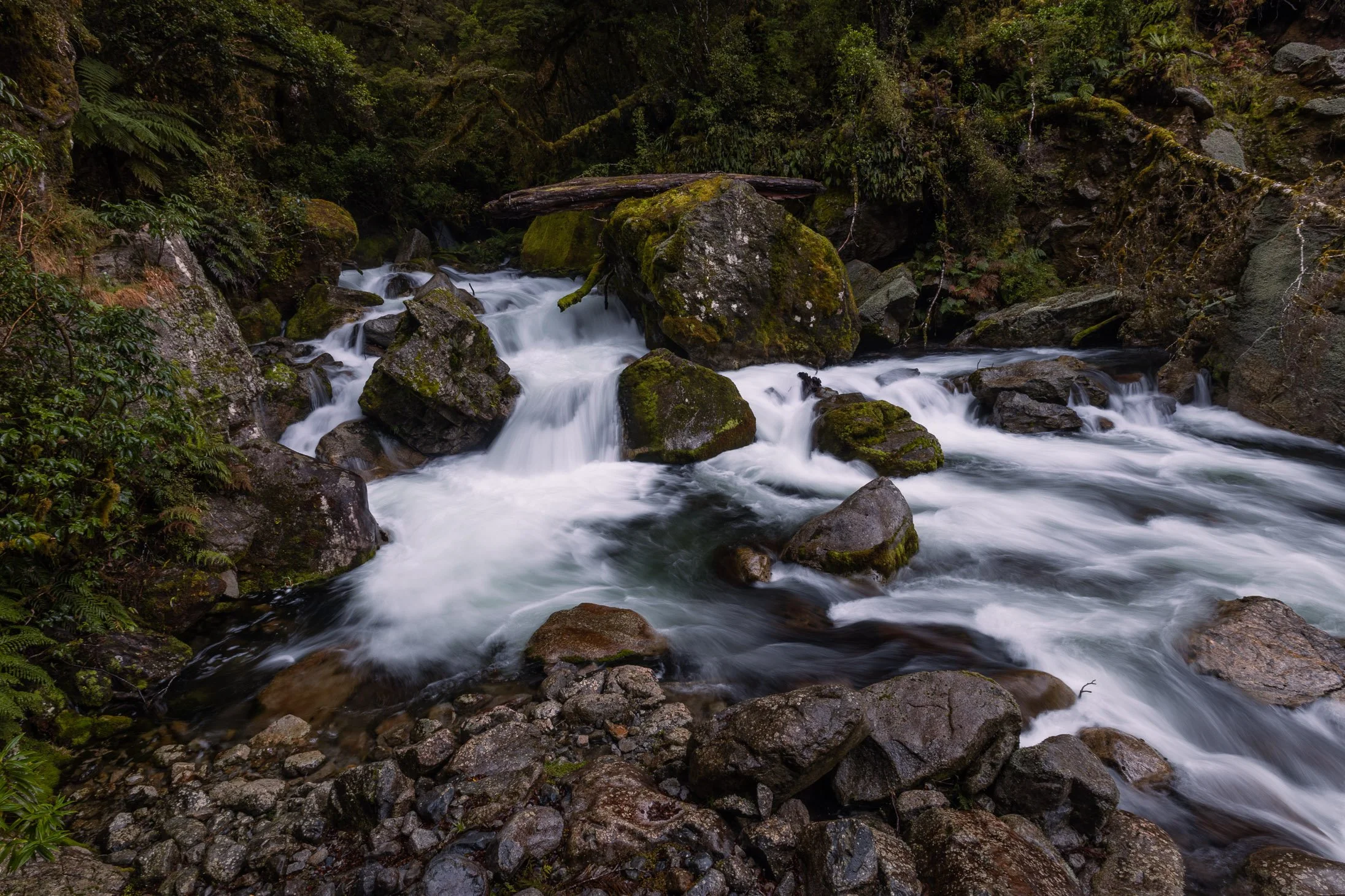
Marian Falls, Fjordland, New Zealand
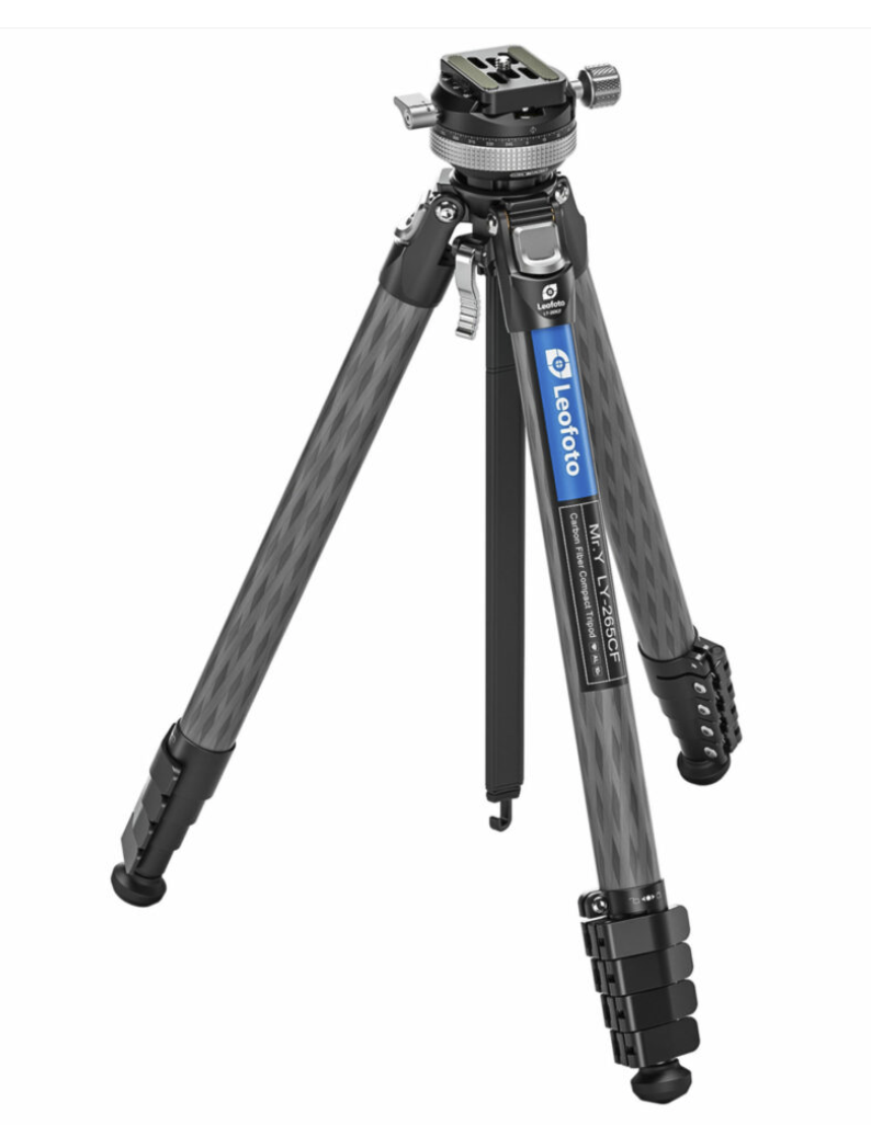
My Favourite Travel Tripod
Twizel, New Zealand
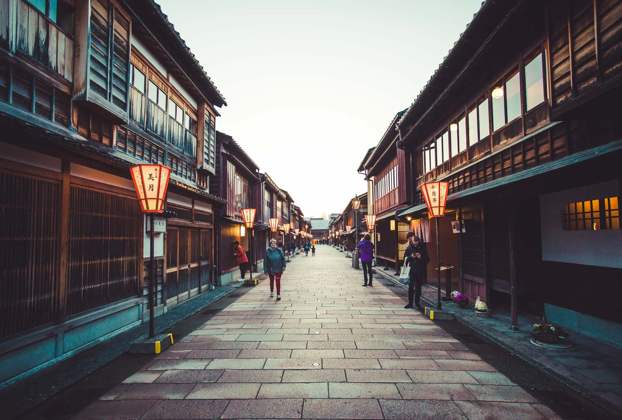
Tea District, Kanazawa
1. Rhythm: Visual Patterns and Musical Beats
The repetition of shapes and lines mirrors Rhythm and Pattern in audio.
When you repeat an element in a photo, you are essentially creating a visual "beat.
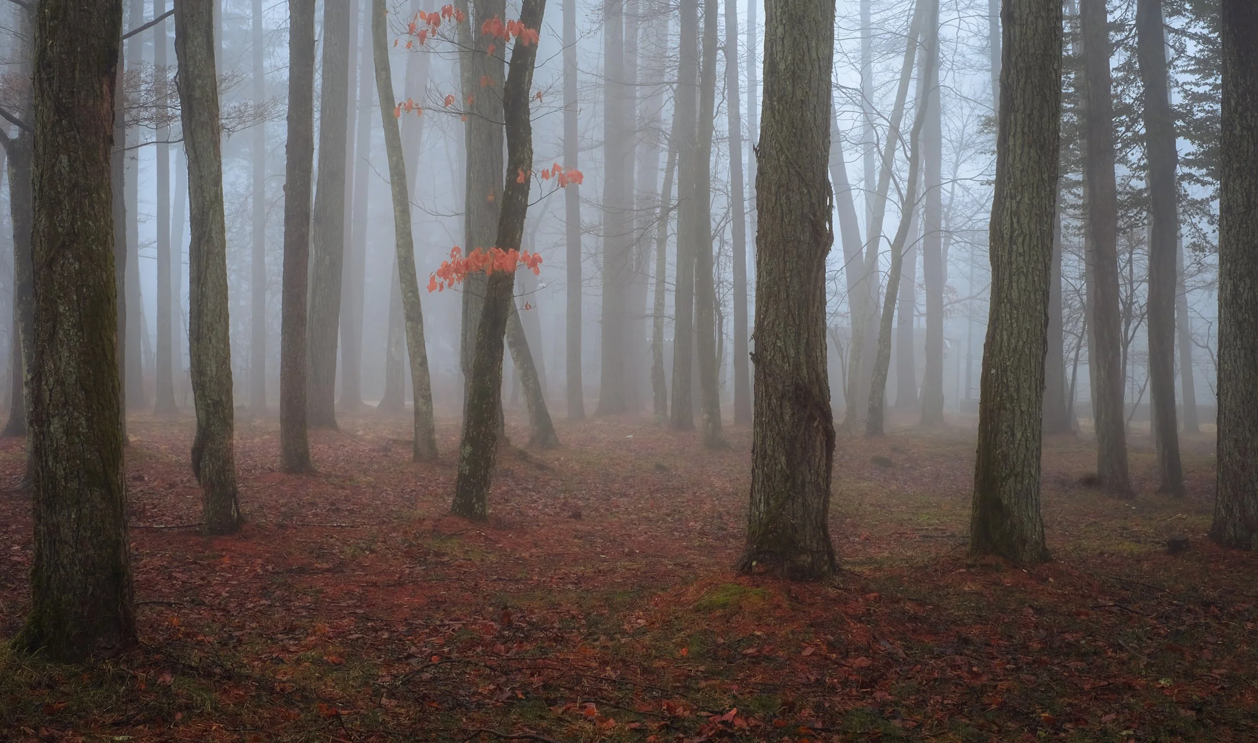
Mt Fuji Forest Fog
2. Harmony: Color Balance and Chord Progressions
Musical harmony creates a unified sound. In photography, we achieve this through complimentary colors that blend well together.
3. Contrast & Tone: Light/Dark and Loud/Soft
Contrast is the engine of drama. In music, this is "dynamics". In photography, it is "chiaroscuro"—the stark transition between deep shadows and bright highlights like a dark or bright note on a piano.
Arashiyama, Kyoto
4. Repetition and Variation: Motifs and Themes
This involves taking a single element and repeating it with slight changes to keep the viewer or listener engaged.
Arashiyama, Kyoto
5.Texture in a singer’s voice could be a rough growl or smooth as silk. Texture in photography is the tactile nature of the subject or object. Just like the wet morning drops on a leaf or the rough and rusty metal on an old tin roof.
Why not treasure hunt particular clusters of color ? The psychology of color in photography is all about how different hues trigger specific emotional responses and guide a viewer's eye through an image. Photographers use colour not just for realism, but as a tool to tell a story or set a specific mood. Below is a list of the positive effects that colours can have with certain emotions. I have also added some inspirational quotes for each colour.
"The Decisive Moment"
— Henri Cartier-Bresson
• Energy • Warmth • Strength • Impulse • Dynamism.
• Activity. • Courage. • Excitement. • Love • Passion
• Dominance • Happiness
"When you laugh & cry with their laughter & tears, you will know you are on the right
track"
— Arthur Fellig
• Cheer. • Hope. • Vitality. • Expansion. • Optimism.
• Philosophy. • Luminosity. • Enlightenment. • Communication
"One should really use the camera as though you'd be stricken blind"
— Dorothea Lange
• Energy. • Cheer • Activity
• Excitement. • Warmth. •Friendliness
"It's weird that photographers spend years or even a whole lifetime trying to capture
moments that added together don't even amount to a couple of hours"
— James Keivom
• Nature. • Durability. • Reliability
• Realism. • Warmth. • Comfort. • Cozy
"The camera can photograph thought"
— Dirk Bogarde
• Power. • Sophistication. • Sexuality
• The Unknown • The End of a Cycle
"Photography is an art of observation, I've found it has little to do with the things you see
and everything to do with the way you see them"
— Elliott Erwitt
• Neutrality. • Intelligence. • Futurism • Modesty • Technology • Secure
• Liberalism. • Tranquility • Cold. • Retirement. • Indifference
"Photography is an illusion of reality with which we create our private world"
— Arnold Newman
• Purity. • Cleanliness. • Truth. • Innocence. • Chastity
• Spirituality. • Sophistication. • Refinement. • Newness
• Blandness. • Sterility
"I need to be an objective observer to maintain my sense of composition"
— Werner Bischof
• Nature. • Growth. • Fruitfulness. • Renewal. • Freshness • Tranquility.
• Hope. • Youth. • Health. • Peace. • Good Luck • Coolness
"I wish more people felt that photography was an adventure the same as life itself and felt
that their individual feelings were worth expressing"
— Henry Gallahan
• Spirituality • Trust. • Truth • Cleanliness • Tranquility
• Contentment • Passivity • Understanding • Conservatism. • Security
• Technology • Masculinity • Coolness & Cold. • Melancholy
"Photography is the art of subtraction. Subtracting any elements you don't want, less is
more."
— Alfonso Calero
• Spirituality • Mysticism • Magic. • Faith. • Unconscious
• Dignity. • Mystery. • Creativity. • Awareness. • Inspiration
• Passion • Imagination. • Sensitivity. • Aristocracy & Royalty
Japanese Perspective: Pink cherry blossoms are the beauty of impermanence & a fleeting moment
Warm colors (red, orange, yellow) are stimulating and advance toward the viewer, evoking emotions like passion and joy. Cool colors (blue, green, purple) create a calming effect, receding into the background to provide depth.
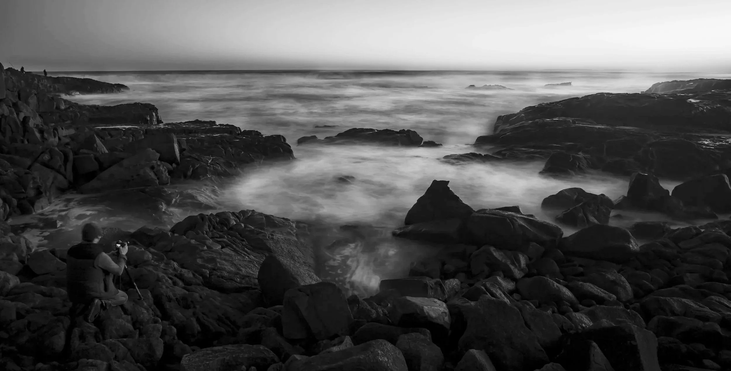
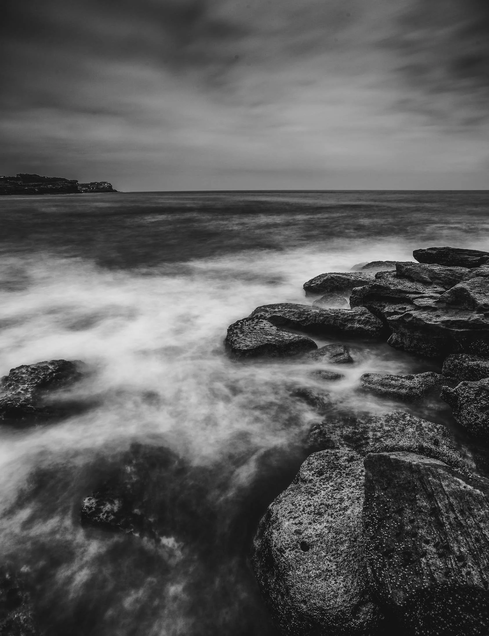
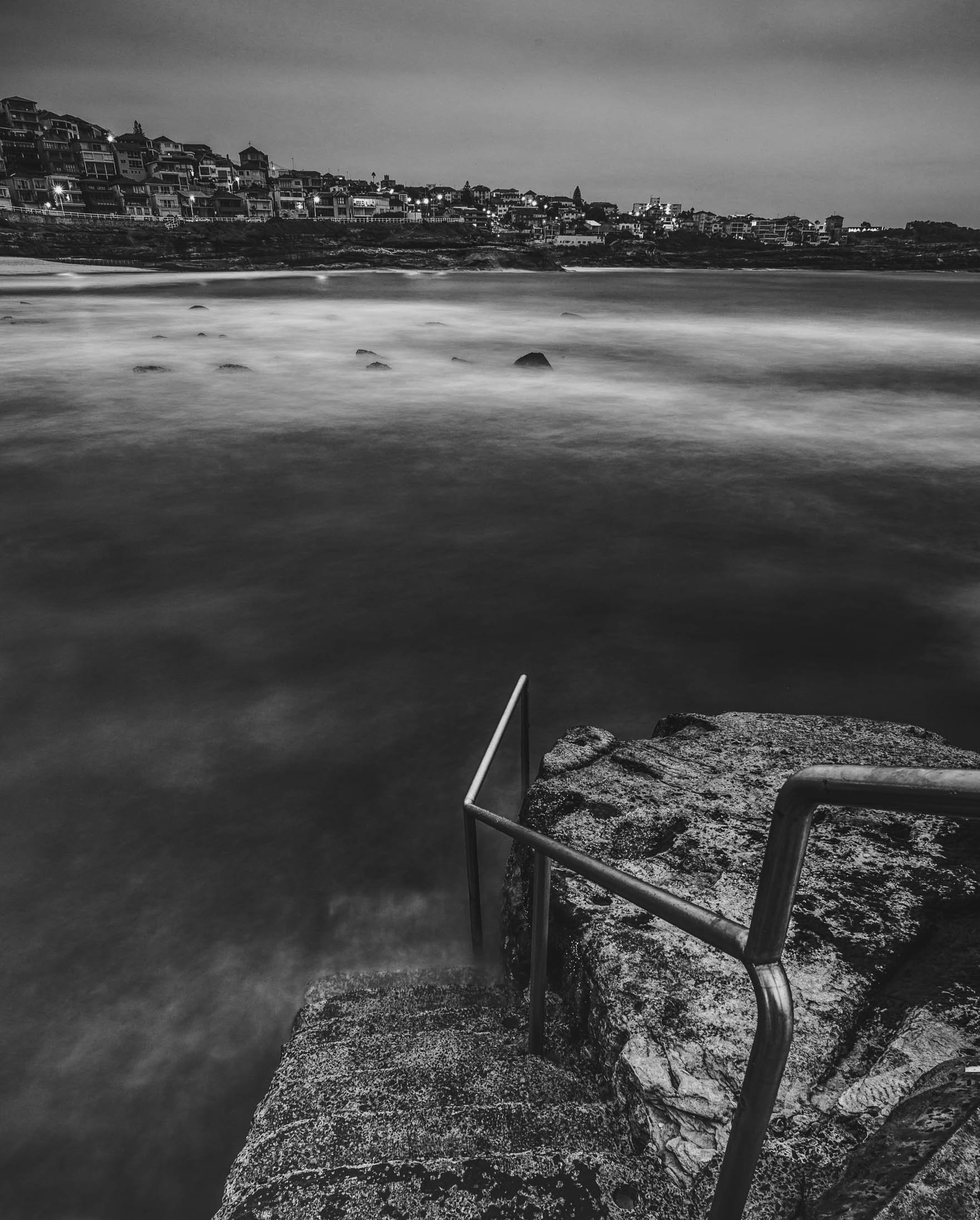
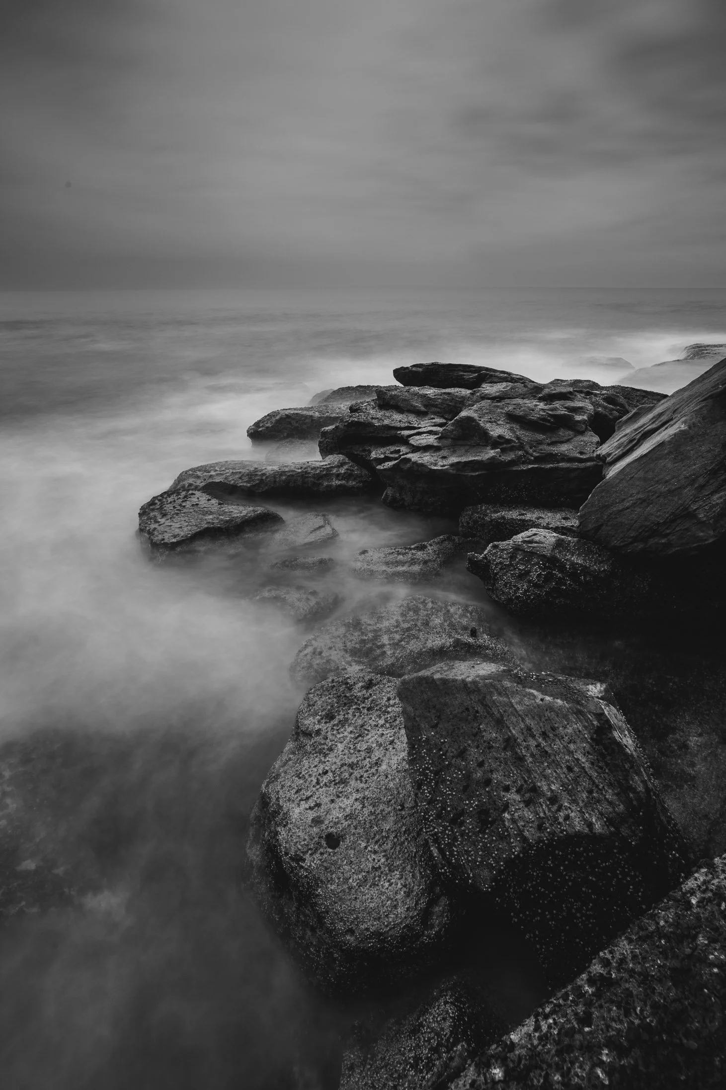
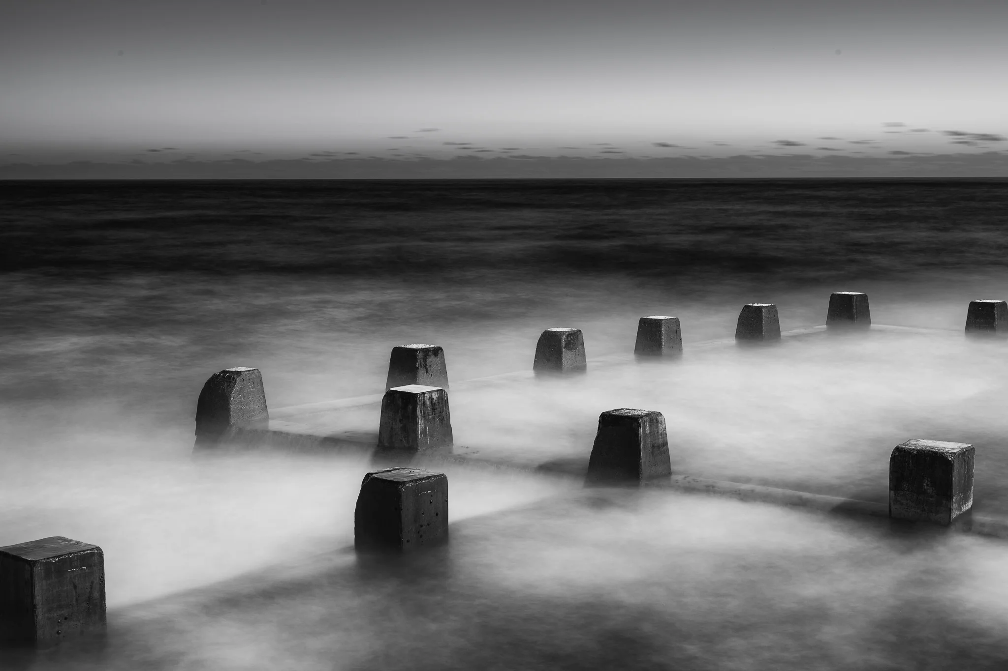
Black and white seascape photography strips away the distraction of color, forcing both the photographer and the viewer to engage with the raw, elemental nature of the ocean.
Here are five reasons why this medium is so compelling:
Birrubi Beach, Port Stepens
1. Emphasis on Texture and Contrast
Without color to differentiate elements, the "feel" of the image takes center stage. You can emphasize the jagged, tactile surface of wet rocks against the soft, ethereal spray of crashing waves. The interplay between deep shadows and bright foam creates a l la range that feels more dramatic and powerful than a color equivalent.
2. Timelessness and Abstraction
Color often anchors a photo to a specific time of day or season (like the orange of a sunset). Black and white removes those chronological markers, lending the seascape a timeless, fine-art quality. It allows the viewer to focus on the ocean as a primal force rather than just a specific afternoon at a specific beach.
3. Masterful Use of Long Exposure
Seascapes are the perfect playground for long-exposure techniques. Converting these shots to monochrome highlights the tonal gradients created by moving water.
Mist-like water: Long exposures turn chaotic waves into a silky, fog-like texture.
Leading lines: Without color, the structural lines of a pier or a receding tide become much more prominent, guiding the eye through the composition.
4. Highlighting Form and Geometry
In monochrome, the composition relies heavily on shape and silhouette. The curve of a shoreline or the vertical starkness of an ocean pool becomes a structural element in a larger geometric puzzle.
5. Evoking Mood and Atmosphere
Black and white excels at capturing the "soul" of the weather.
Melancholy: A grey, overcast day becomes a moody, contemplative study of solitude.
Power: A storm becomes a high-contrast battle between dark skies and white crests. It simplifies the emotional palette, allowing you to tell a clearer, more evocative story of the sea’s temperament
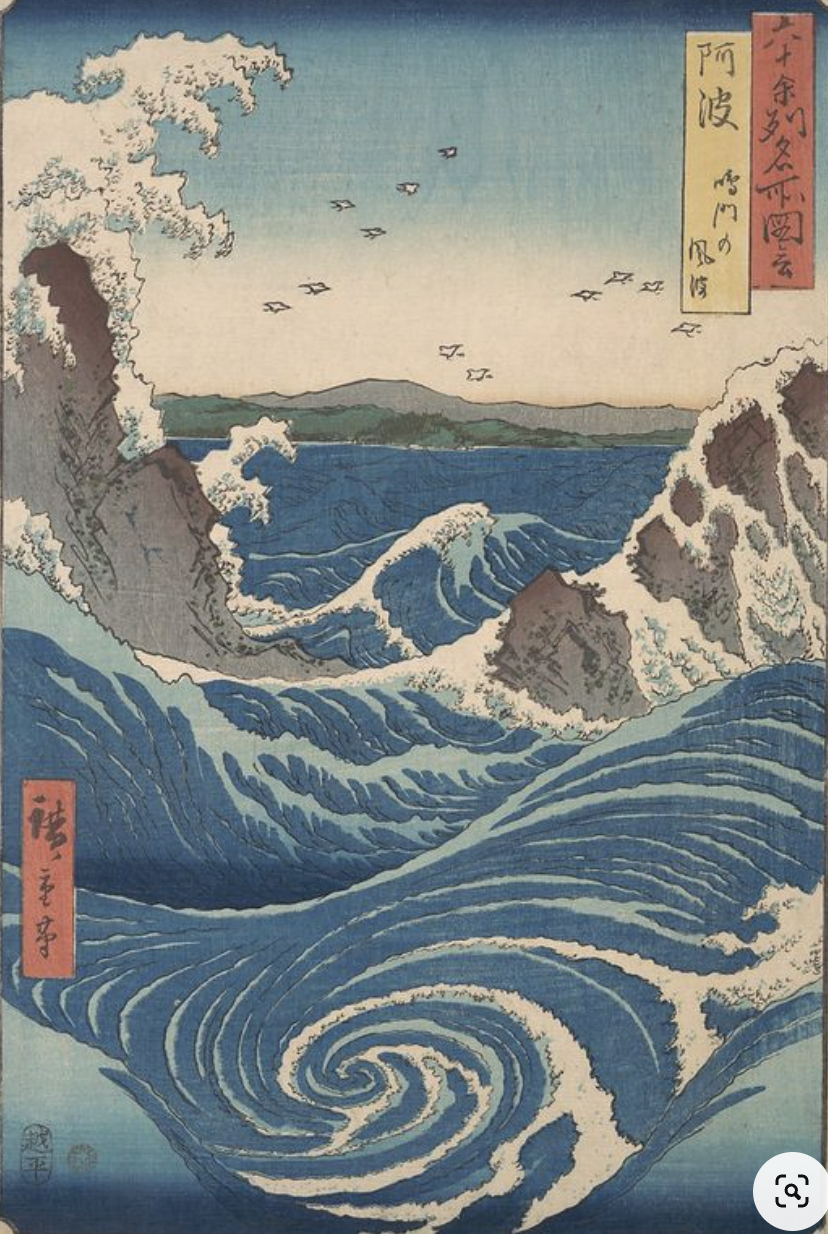
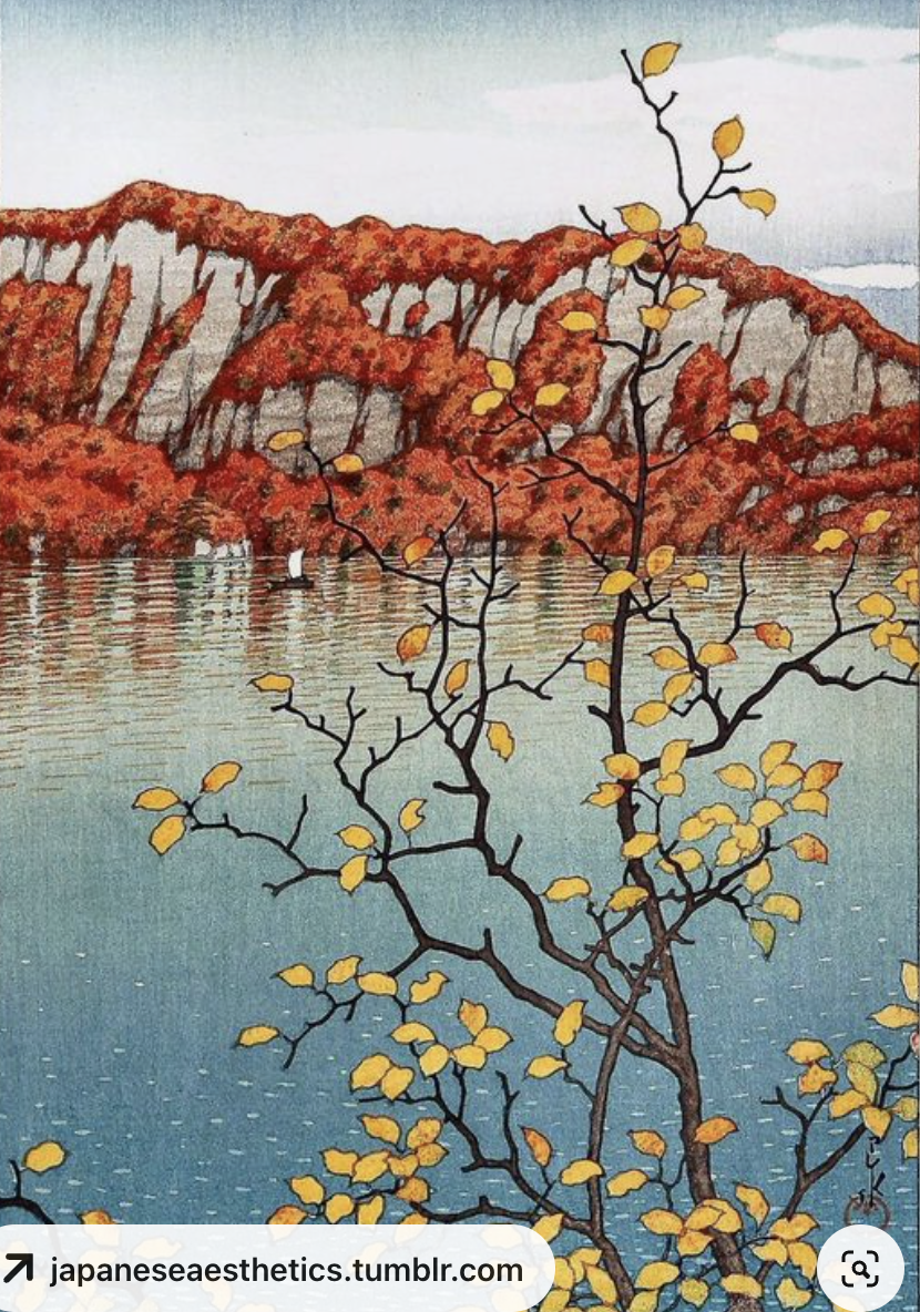
I am especially drawn to Hanga (woodblock prints) from the Edo Period (1603 and 1868). This style of art is known as Ukiyo-e.
In particular I like Ando Hiroshige (1797 - 1858) and Hasui Kawase (1883 - 1957) and their use of colour palettes and compositions, and I've found incorporating these into my photographs captured in Japan quite satisfying.
If you're interested in trying this for yourself with artworks you like, here's a few things to help you on your way.
桜 (Sakura) Lake Kawaguchi
By Hirose Kawase
As a starting point, I research and collect as many images I like in Pinterest and via books from the library.
波紋 (Ripple) Lake Kawaguchi
Naruto Whirlpool, Awa Province, from the series Views of Famous Places in the Sixty-Odd ProvincesUtagawa Hiroshige Japanese
1. Collect as many images of the artists or artists you like in Pinterest and books (library)
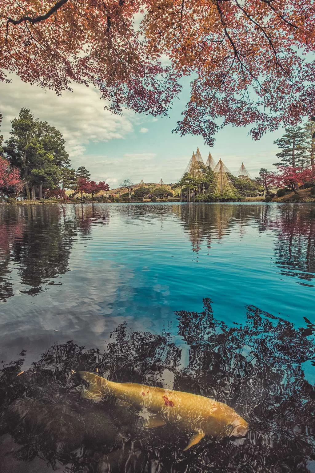
鯉 (Koi) Kenrokuen, Kanazawa
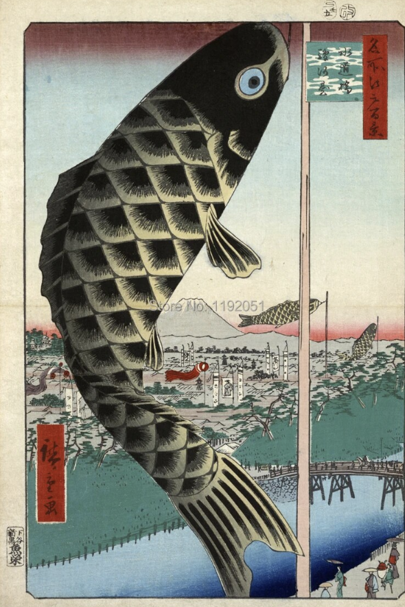
Suido Bridge and Suruga Hill By Ando Hiroshige
2. Take a screenshot of the paintings you like and find out the 5 main colours used in their palette (i.e app color harmony)
紅葉 (Autumn Leaves) Kenrokuen, Kanazawa
By Kawase Hasui
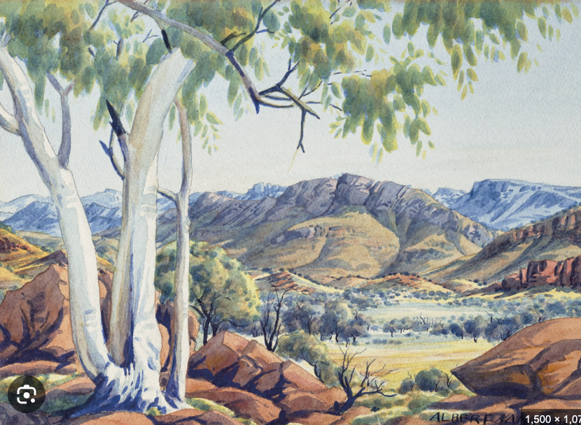
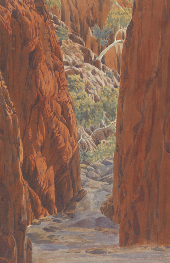
Albert Namatjira was an Arrernte painter from the MacDonnell Ranges in Central Australia, widely considered one of the most notable Australian artists. As a pioneer of contemporary Indigenous Australian art, he was arguably one of the most famous Indigenous Australians of his generation.
Albert Namadjira
Uluru
Albert Namadjira
Uluru
His colour palate and compositions were simply a source of inspiration not a copied influence.
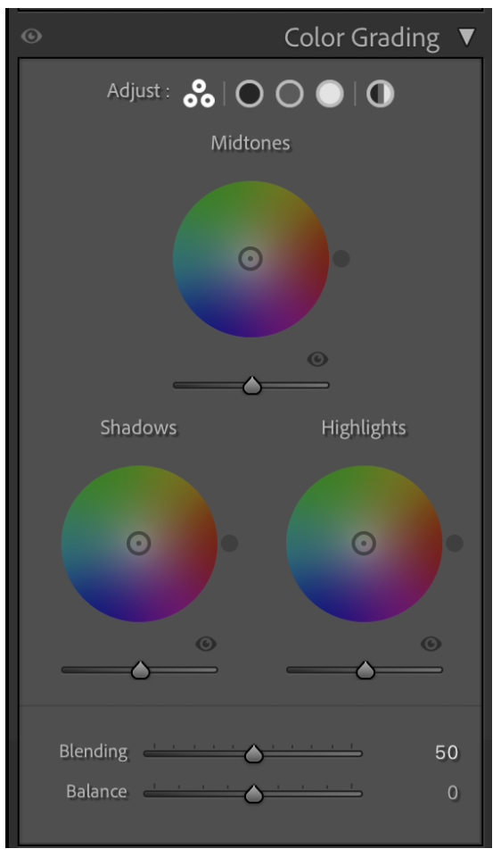
3. Apply similar colors (not exact) in Lightroom through colour grading (Midtones, Highlights and Shadows) and other lightroom tools to get close to the gamut of colors used.
From there, it's then a matter of either shooting a similar composition to your subject, or capturing something else entirely, and then matching the colours from the painting to your photo.
You do this through applying similar colours in Lightroom in the Colour Grading section of the Develop module (by adjusting the Midtones, Highlights and Shadows) to get close to the gamut of colours used.
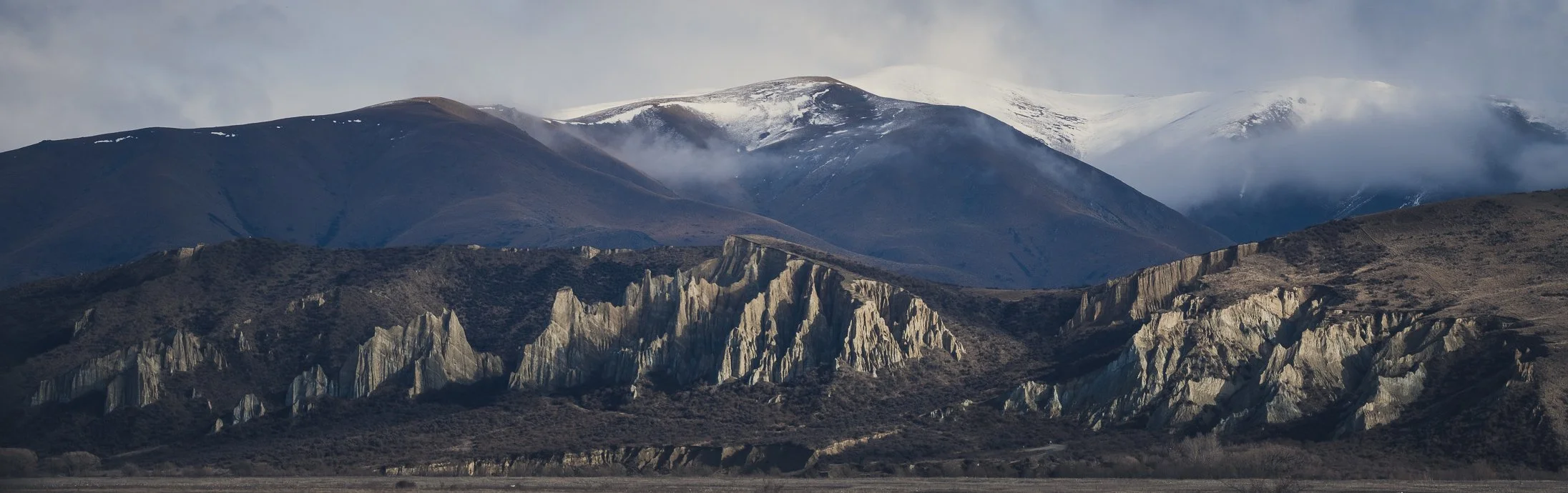
The psychology of shapes in photography refers to the study of how different shapes and their characteristics can evoke certain emotions, perceptions, and reactions in viewers. Shapes are fundamental elements of visual composition and can play a significant role in influencing the psychological impact of a photograph. Here are some common shapes and their psychological associations:
Brisbane City
It's important to note that the psychological impact of shapes can also be influenced by color, lighting, context, and personal experiences. Different individuals may interpret shapes in photography differently based on their cultural background and individual perceptions. Therefore, understanding the psychology of shapes can help photographers communicate specific emotions or messages effectively, but it's important to consider the overall composition and context of the image.
Brisbane City
Circle Shape
No angles means softer or milder. Circles often convey a sense of eternity as they keep looping back to the same point.
March Fire Festival, Kyushu, Japan
Circles: Circles are often associated with unity, harmony, and perfection. They can create a sense of calmness, balance, and continuity. Circles can also evoke feelings of protection and nurturing. In photography, circular shapes can be found in objects like sunsets, full moons, or round architectural elements.
Aizumura, Fukushima, Japan
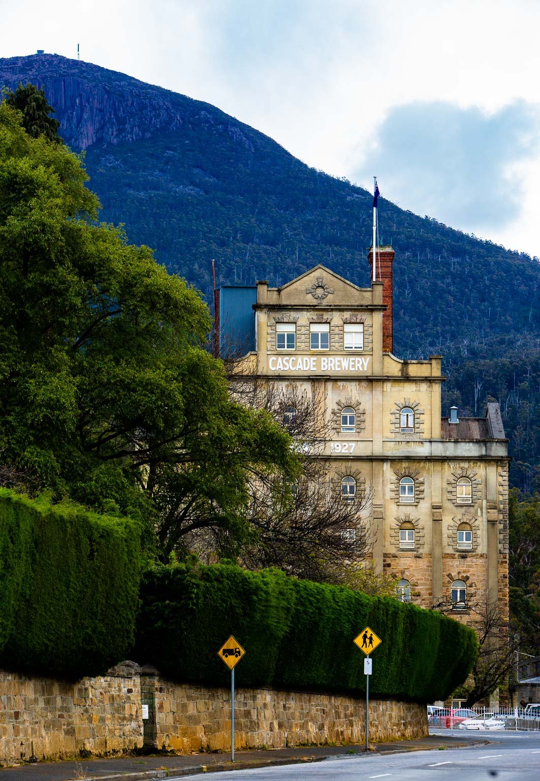
Square & Rectangle Shape
Formed by straight lines and right angles which convey a sense of reliability and security. Feeling of safety and containment.
Squares and Rectangles: Squares and rectangles are associated with stability, order, and rationality. These shapes often convey a sense of reliability, balance, and structure. They can create a feeling of solidity and represent man-made objects or architectural elements.
Cascade Brewery, Hobart, Tasmania
Triangle Shape
A Polygon with 3 edges and 3 vertices which often depict an ambiance of energy and dynamic shape. Triangles also convey motion and direction.
Triangles: Triangles are dynamic shapes that can convey a sense of tension, energy, and movement. They are often associated with power, strength, and stability. In photography, triangles can be created by converging lines or by composing the image with triangular shapes, leading the viewer's eye towards a focal point.
Matsumoto Castle, Japan
Natural Shapes
They are more organic and represent elements we can relate to in the natural world such as flora and fauna. These shapes are often formed by angles and points. Even shadows or negative space can create natural shapes as well
Curved Lines: Curved lines are organic and flowing, often associated with grace, softness, and elegance. They can create a sense of tranquility and evoke emotions like calmness and relaxation. In photography, curved lines can be found in natural landscapes, flowing rivers, or the contours of a person's body.
Sado Island, Japan
Abstract Shapes
Often shapes that repeat themselves with or without order in a pattern. Sometimes creating order in the chaos or rhythm in the object or subject hard to decipher or contain.
Aoraki/Mt.Cook New Zealand
Zigzag Lines: Zigzag lines are dynamic and create a sense of energy, excitement, and action. They can convey a feeling of chaos or instability. Zigzag lines can be used to add a sense of movement or tension in a photograph, capturing the viewer's attention and adding visual interest.
Water Reflections in Twizel, New Zealand
Geometric Patterns: Geometric patterns, such as grids or repeating shapes, can create a sense of order, precision, and efficiency. They often convey a modern and organized aesthetic. Geometric patterns can be found in architectural photography or in man-made structures.